A well done website is the easiest way to make a strong and lasting first impression on your potential clients.
Your website can make a strong and lasting first impression. Unless you have a lot of brand awareness, it's likely much of your target audience has never heard of you before.
Everyone has heard of the importance of first impressions. This is where the phrase "dress to impress" before a big job interview comes from. First impressions stick, so much so that they can alter a person's visual perception, their behavior attribution, memory, and even other people's behavior.
When a user first comes to your website, they decide within seconds as to what their opinion of you is. If your website looks archaic and unappealing, they will have a negative impression of your business causing them to leave your site and go to a competitor.
Your website is a direct representation of your business, your brand, and your identity. It should be able to tell a story and communicate to your audience exactly who you are. If you were to look at your current website, what kind of impression would you get? Does it accurately represent your brand and how you want to be perceived?
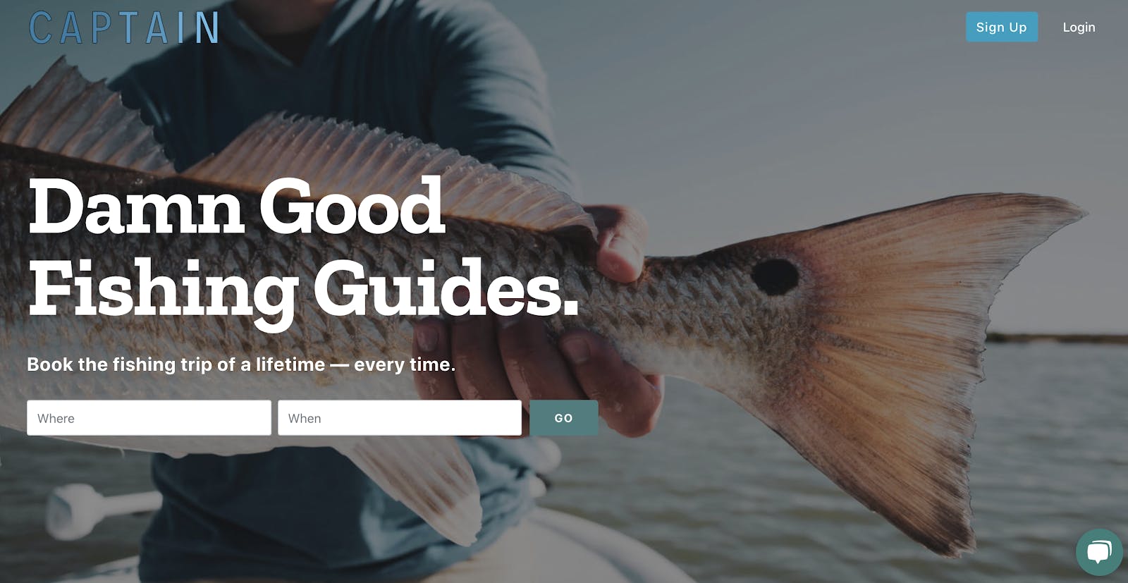
Our first website was made on a budget, so not only was it bare bones, it was also pretty generic. We were given some bad advice about 'professionalism' and 'getting out of the searcher's way' which sounds good in theory, but in our case, it just meant our site was bland and forgettable. When we built a new site from the ground up, we did so with strong branding in mind. We wanted our site to have a personality that would stick with the visitor and bring them back later on. Since many people browse our site without the full intent of booking at first, we had to make our brand appealing and easily-digestible to encourage repeat views and funnel visitors back to their ideal booking, breaking down as many barriers as possible. While there were several factors at play, our first site's conversion rates topped out around 8%. Now 13% is our absolute baseline, and the number goes up dramatically with repeat visitors, maxing out at around 21% for visitors who've landed on our site more than three times in a month.Quote:
Jonathan Newar, CEO of Captain Experiences
Before you decide if it's time to update your website, consider that maybe your website isn't performing to its maximum potential. Here are some of the top reasons as to why web design is important.
Good Web Design Elevates Your Marketing
Oftentimes when people get a new website, they decide to simplify things. Going for a cleaner feel with easier navigation and an overall modest look. It certainly makes sense. If a user has a difficult time finding the information they came to your site for, they are just going to leave.
Part of the web design process involves making information easier to access and easier to read. Users may not even read your content, rather scan it for fixed points and anchors to help guide them through the page. Content needs to be formatted in a way that makes it easy for a user to scan and consume.
If a user sees a large block of text, they will get easily overwhelmed and won't stay on the page. Adding helpful visuals, such as videos and interactive images or graphics helps to keep users engaged.
Web design can also help your site load faster. Landing pages that take more than five seconds to load see an average bounce rate of 38%. It only continues to go up from there.
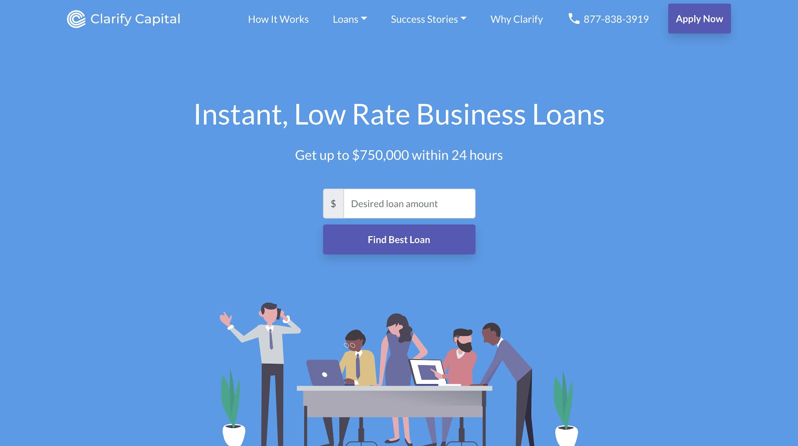
We redesigned our website, with a heavier focus on user-experience and key features that play into SEO. The new site is easier to navigate, loads faster, and has more interactive and video content. The first thing we saw was a spike in engagement, which we mostly attributed to the strategic change in content presentation. Consumers are now staying on the site longer to watch videos and take mini-quizzes and assessments. When we reviewed benchmarks, we saw average time on page increasing from 1.4 minutes to 2.2 minutes and a sizable, 10% decline in bounce rate. The end result of our website optimization initiative has been significantly improved sales, with total converted leads up by 30%.Quote:
Kimberly Smith, Marketing Manager at Clarify Capital
With Google continually putting more of an emphasis on user experience, you can see how integral web design is to marketing.
Google studies user behavior and takes that into account with SERP rankings. If Google sees that users are not engaging with your site or if they are immediately leaving your site and going to another, then Google will think users are not finding your content relevant and they will drop you down in the SERPs.
Alternatively, if Google sees that users are having a positive experience on your site, they may give you a boost in the SERPs.
Web Design is All About User Experience
Web design isn't just about making a website more aesthetically pleasing, it's also about making it more functional. Things like navigation and button placement take precedence before creative design. That being said, you can still have many creative elements that help to make your website unique.
Anyone can present information to a user, what you want to do is present an experience.
There are a lot of websites out there, what makes yours stand out from the rest?
Many modern websites today offer striking visuals and interactive elements that leave a memorable impression on its users. However, you don't necessarily want to reinvent the wheel. Go too flashy and you run the risk of slowing down your website, confusing users, and leaving them with an unpleasant opinion of your brand.
Users like simplicity and expect some familiarity with certain website elements. For example, users are used to seeing important information in the top right hand corner. This could be where your phone number is, a contact us button, a login button, or a "free trial" button.
Try to keep things simple, but don't be afraid to get creative. At the end of the day just keep your users in mind and focus on making your website an experience and not just another interface.
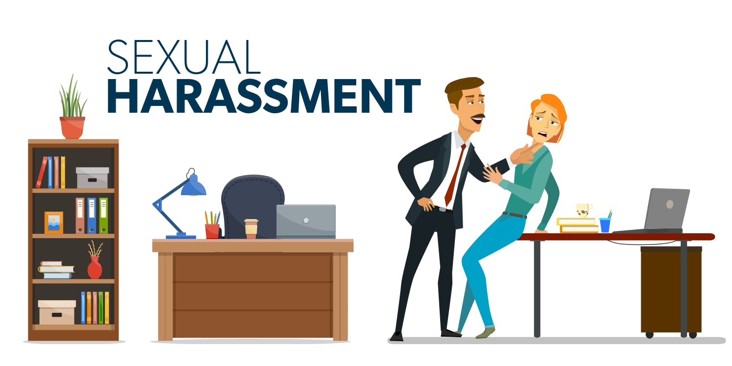
User experience is one of the most important aspects of web design and SEO. For example, in our guide about workplace sexual harassment, we put an emphasis on user experience by making our content easy to read through formatting, incorporating a table of contents, CTAs after each section and relevant, high-quality graphics. The stylized graphics help to make the website stand out apart from the competition and they are unique to the brand. They help to leave a memorable experience with users.Quote:
Hunter, with Drew Lewis, PC
Web Design Builds Trust
According to web credibility research done by Stanford, judgements on a company's credibility are 75% based on the company's website design.
Having an outdated looking website doesn't exactly instill a lot of trust in your users. One of the very first steps in garnering trust is by having a professional and legitimate looking website.
With the standard for what is considered well designed always shifting, a modern website can feel outdated pretty quickly. However, there are some tried and true design elements that continue to stay evergreen.
Color schemes heavily impact a company's perceived value and influences a consumer's decision to buy. For example, if you utilize a lot of white space in your design, that can come across as clean and well organized. Alternatively, using a lot of dark colors in your scheme can cause the site to feel very crowded and messy.
Apart from visual design, you also want to be mindful of things like typos, broken links and images, or other similar mistakes. These can quickly degrade any credibility you might have built.
Having quality content also plays a large role in building trust. Users appreciate seeing large amounts of content as it showcases your expertise and helps establish you as an authority. It also shows your willingness and desire to help your customers. That being said, there is a fine line between having the right amount of content and too much content.
As we touched on earlier, formatting is important. If you are going to have large amounts of text, make sure it's easily digestible. Having too much text that isn't formatted properly will make your site feel very cluttered.
Getting a new website was one of the best decisions I've made recently for my company. It proved to me that when something's not working, it means it's time for a change. Our old website generally had an outdated design. Compared to other websites online, it looked like it wasn't well-maintained. This casts doubts on the customers' minds, mostly about the legitimacy of the business and whether it's still in operation. "When we got a new website, we saw positive results coming in by the second week. Our bounce rate decreased from 63% to 54%, which is a huge win for us considering the stats we've seen in the past. The first thing we changed was the overall graphics of the site. We made it cleaner and easier on the eyes, making our business look more authoritative. With this, we've seen an increase in our conversions by 21% during the first month. Overall, this experience taught us that a website isn't a set-it-and-forget-it kind of thing. It must be constantly monitored and updated when it needs to be, regardless if you need to make small changes or do a total overhaul. Of course, an overhaul must be made only when absolutely necessary, as in situations where it looks very outdated. You don't want your customers coming back to a 'new' website each time they visit your page.Quote:
Peter Mann, Founder of SC Vehicle Hire

As Peter said, you don't want to leave your website stagnant. It's important to continue to update it to keep up with the ever changing design trends.
Responsive Web Design
Responsive web design is pretty much the standard these days. We live in a multi-screen society where 50% or more of your search traffic will be coming from a mobile device of some sort. Not only that, but there are now a vast array of screen sizes that need to be taken into account. We are not just talking about smart phones either, you can now browse the Internet on smart watches, hand-held video game consoles, and even eyeglasses (Google Glass).
Incorporating responsive design into your website is no easy feat. This requires rebuilding your website from the ground up.
However, even though this is more of an investment up front, you save yourself time, money, and effort down the road. It's more cost effective to have one responsive website vs. having multiple versions of your site.
Responsive websites are also great for search engines. Google puts a heavy emphasis on mobile-friendly websites and even recommends you make your website responsive.
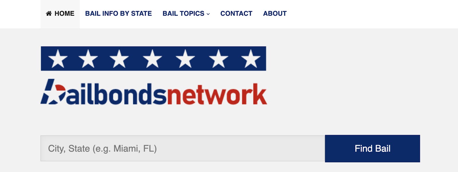
Our old website was not mobile responsive at all. The design remained the same whether accessed via a desktop or mobile device. We wanted to retain the same clean layout, but also updated the logo and optimized the color scheme and call-to-action buttons and ads. Our mobile traffic increased from just 35% to an impressive 75%. We have run various websites in the past but we have never had a website with such a high mobile %. Part of it has to do with our audience being on-the-go and needing access to our information on their mobile device. Once we switched to a mobile-friendly website, our traffic skyrocketed and we were able to reach the full potential of our target audience. Our ad revenue increased (23% increase YOY) and our premium listings saw an uptick as more businesses reached out to us to be featured, primarily due to ranking improvements in Google. We also optimized our call-to-action buttons and made it easier to navigate our website to improve leads and conversations for our premium business listings.Quote:
Adi Dzebic at Bail Bonds Network
Web Design Can Improve Conversions
There are a lot of psychological tactics that are used in web design that help drive conversions. For example, the idea of simplicity is not only for a cleaner feel, it also limits the number of choices a user has.
Have you heard of Hick's Law? It’s named after British psychologist William Edmund Hick. The law states that the time it takes for an individual to make a decision is directly proportional to the possible choices he/she has.
That means that if you have a large navigation menu, or tons of different links and services on a page, it's going to cause users to lose interest in all of the options altogether and leave.
Keeping things simple can help eliminate the number of choices a user has, and more importantly, can help guide users to your end goal.
We also know that color scheme matters. Not only does color help set the tone of how you want your brand to be perceived and what emotions are associated with it, it also helps to guide user's attention to elements within the webpage that you want them to interact with.
Take Hotjar for example:
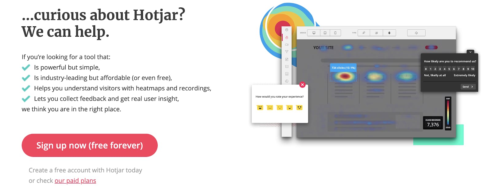
They utilize a lot of white space, but they also have a bold action color for their call-to-action. Your eyes immediately gravitate towards it, which is exactly what they intended.
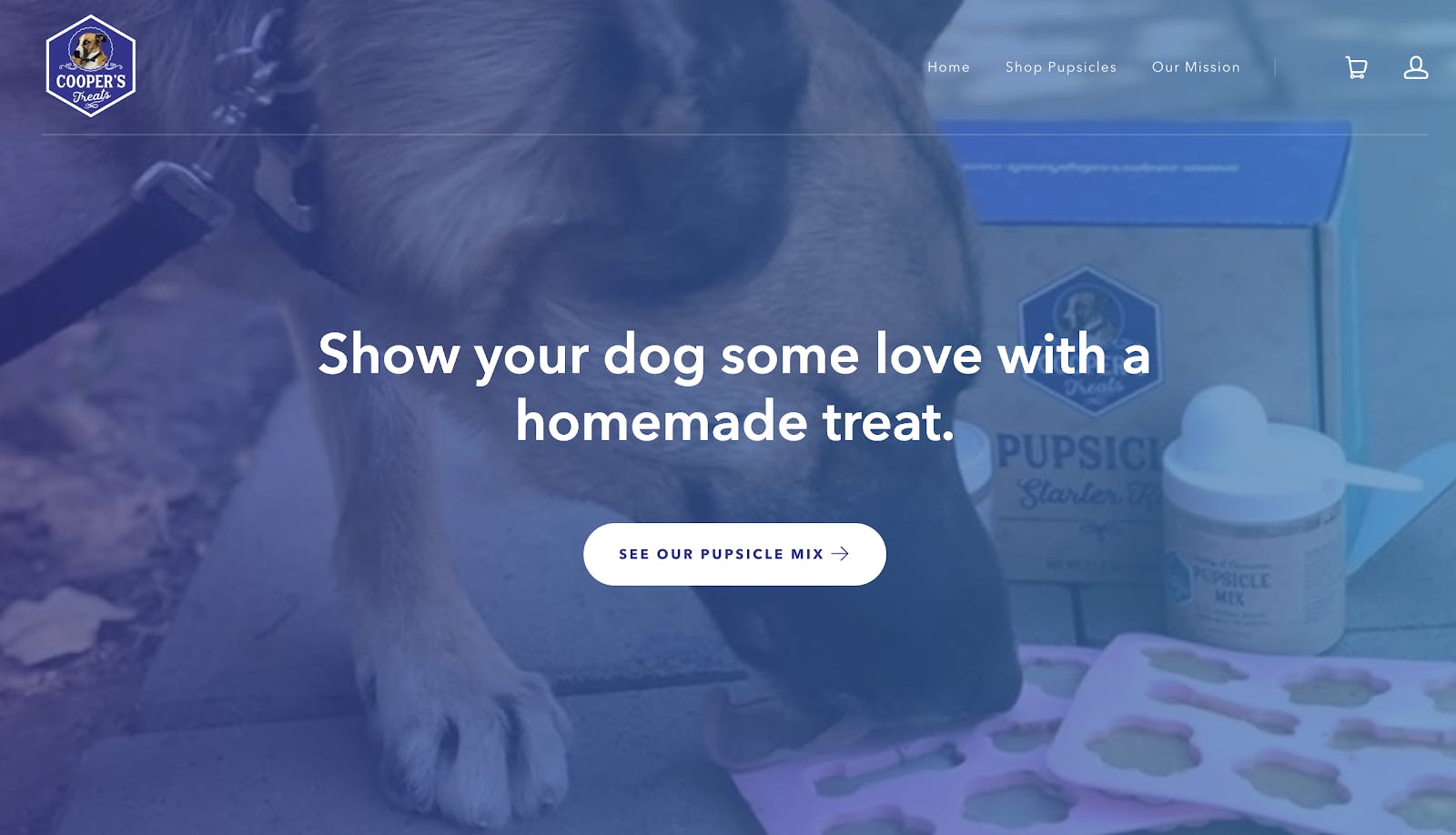
I launched a brand new, updated website a couple of months ago, and it's made a huge difference to my conversion rate. I launched the company in May, and as I'm new both to ecommerce and the pet goods space, I wanted to get it running as cheaply as possible, so I just used a free Shopify theme and set it up as quickly as I could. After a few dozen sales and a lot of great customer feedback, I felt confident that I had a good product to spend a little more time and money to get something much better looking. I paid a consultant a few hundred dollars to review the site from a CRO perspective, and I took his feedback along with a lot of great photography that I've received of customers' dogs with our products, and I set up a new Shopify site using a premium template. I think it looks vastly better now, and the people visiting the site seem to agree.Quote:
lex Willen, Founder of Cooper's Treats
Conclusion
Getting a new design for your website can feel like a large commitment, especially if you are building it from the ground up. Costs can be a large pain point for many people, but considering the fact that a new website can potentially increase traffic and sales, it should be viewed as an investment and not a burden on your wallet. Your website plays a crucial role in driving revenue and increasing business growth. It's a direct extension of who you are, and how users perceive your brand. If you don’t feel like your website is performing to its full potential, or if you feel it's not representing your brand accurately, then it may be time to look at getting it updated.
If you're still unsure of the direction you should go, get inspired by the best website design, according to DesignRush. Get inspired and change up your web design for a better response.
