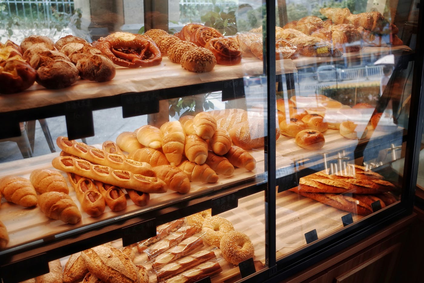
Just like a pastry, every website has a unique style. Some are sleek and minimalist, like a perfectly laminated croissant. Others are loud and colorful, the digital equivalent of a sprinkle-covered donut.
I am usually behind the times when it comes to TV shows. I hear the hype, but I always assume nothing can live up to it, so why bother? The must-see shows come and go, and sometimes, I catch up later. Case in point: I just started watching The Sopranos. Talk about being late to the party. I heard the hype, avoided it, and now, thanks to streaming, I’ve been transported back in time to see what all the fuss was about. And you know what? It does live up to the hype.
Another show that’s been hyped to the heavens? The Great British Bake Off. "Oh my goodness, you have to watch it—the competition, the tension, it’s amazing!" people said. Meh, I thought. It’s baking. Cut to me, sitting on the edge of my couch, screaming NO! at some poor British woman because her final bake was ridiculous. She was winning, and she blew it in the last moment. And just like that, I was hooked. The tarts, the tortes, the cream cakes, the sticky buns—I was in. Like some sort of diabetic/heroin addict hybrid, I had transformed into a full-fledged British Bake Off junkie.
So, as I sat at my desk, casting about for a topic to write about, my mind was still swimming in images of cakes and confections. And then it hit me—bakers and designers have much in common. Some creations are fancy and frilly; others are simple and solid. Could a person’s favorite pastry signal their design style? Interesting? I think so.
With that, let’s dive in and see if this one holds cream!
As I sat there, still emotionally reeling from that last-minute Bake Off disaster, I started thinking—baking isn’t just about ingredients and technique. It’s about style. Some bakers are all about precision and elegance, crafting impossibly delicate pastries that look like they belong in a museum. Others go bold, piling on frosting and sprinkles with wild abandon. And then there are those who focus on comfort—warm, gooey, stick-to-your-ribs goodness.
And that got me thinking… Isn’t web design the same way?
Just like a pastry, every website has a unique style. Some are sleek and minimalist, like a perfectly laminated croissant. Others are loud and colorful, the digital equivalent of a sprinkle-covered donut. Some aim for timeless elegance, while others embrace bold, unapologetic personality.
So, let’s have a little fun. What if we matched design styles to their pastry counterparts? Because, let’s be honest, choosing a favorite pastry is about more than taste—it’s about who you are (or at least, who you want to be).
Ready? Grab a coffee, maybe a snack—because once we start, you’re going to be craving something sweet.
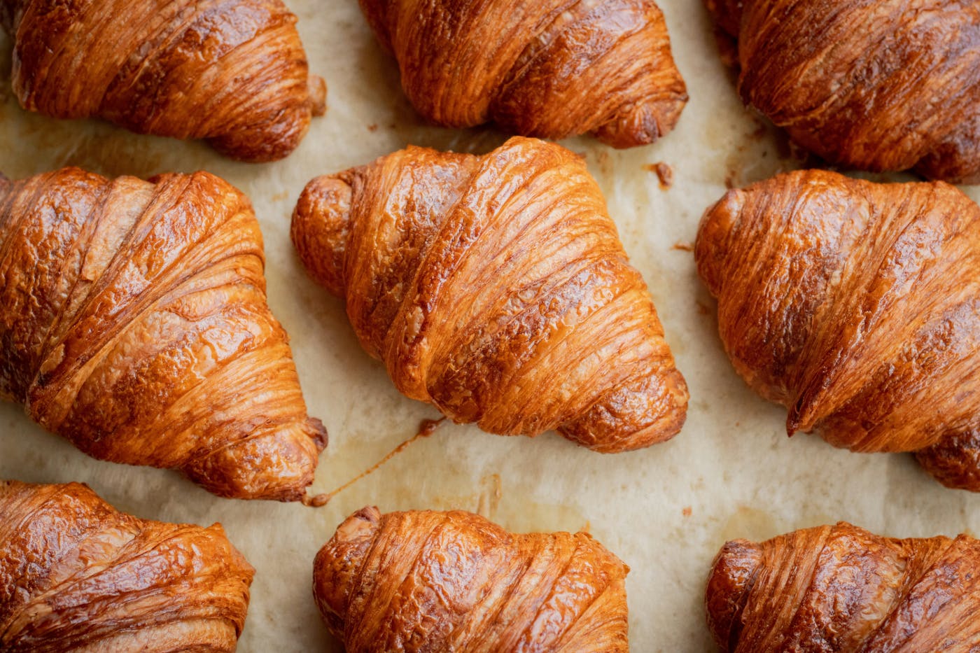
The Croissant – Minimalist & Elegant
Ah, the croissant—deceptively simple, yet refined and intentional in every layer. A true croissant isn’t cluttered with unnecessary toppings or distractions; it relies on technique, quality ingredients, and precision to create something light, airy, and effortlessly sophisticated.
If your favorite pastry is a croissant, chances are your web design style leans toward minimalist. You believe in clean lines, ample white space, and a structured layout that guides users naturally. Your aesthetic is all about understated luxury—letting quality speak for itself rather than shouting for attention.
Think of brands like Apple or Tesla. Their websites aren’t filled with unnecessary bells and whistles. Instead, they use sleek typography, high-resolution product images, and smooth, subtle animations that feel as refined as a perfectly laminated croissant. No distractions—just pure, functional beauty.
But here’s the thing: minimalist doesn’t mean boring. Just like a croissant, which takes careful folding and expert timing to perfect, a minimalist website requires just as much thought and craftsmanship. The spacing, the typography choices, the user flow—it all needs to be intentional. Otherwise, it’s just an empty plate where a croissant should be.
The Donut – Bright, Playful & Interactive
Frosted, sprinkled, filled with unexpected surprises—donuts are the extroverts of the pastry world. You don’t just eat a donut; you experience it. From the moment you see the bright colors and creative toppings to that first sugary bite, it’s a treat that delights all the senses.
Websites that embrace the donut philosophy are all about fun, energy, and engagement. They use bold colors, dynamic animations, and unexpected design elements that keep users interested. If this is your style, you likely love playful branding, intuitive user experiences, and interactive design that makes scrolling through a site feel like a sugar rush.
Think Mailchimp—their brand voice is quirky, their visuals are fun, and their use of playful illustrations makes email marketing (something notoriously dull) feel like an adventure. Or look at Spotify—vibrant gradients, engaging micro-interactions, and a seamless, joyful user experience.
Just like a donut, this style thrives on variety. A simple glazed donut? That’s a well-structured but vibrant website. A donut covered in crazy toppings and drizzles? That’s an ultra-interactive, high-energy website that practically jumps off the screen. The trick, as with all great design, is balance—too much sugar, and it becomes overwhelming; too little, and it loses its appeal.
The Éclair – Sleek, High-End, and Luxurious
An éclair isn’t just a dessert—it’s an experience. The glossy chocolate glaze, the delicate choux pastry, the rich, silky filling—every component is there for a reason, creating an indulgent and refined bite. It’s the kind of pastry that doesn’t just sit in a bakery case; it commands attention.
If your design style leans toward éclairs, you’re all about luxury, high-end aesthetics, and polished presentation. Your websites likely feature dark, moody color palettes, cinematic visuals, and smooth, seamless animations that ooze sophistication. This is the realm of fashion brands, luxury hotels, high-end tech, and premium services.
Look at websites like Louis Vuitton or Rolls-Royce. They don’t flood their pages with excessive content; instead, they let exquisite photography, subtle motion effects, and a confident use of negative space do the talking. They know their audience expects a premium experience, and their web presence reflects that effortlessly.
An éclair-inspired website is all about perceived value. Everything from the font choices (sleek sans-serifs or elegant serif typefaces) to the loading transitions (slow fades, smooth scrolling effects) is curated to make visitors feel like they’re stepping into something exclusive. Just like a well-made éclair, it’s all about precision and attention to detail.
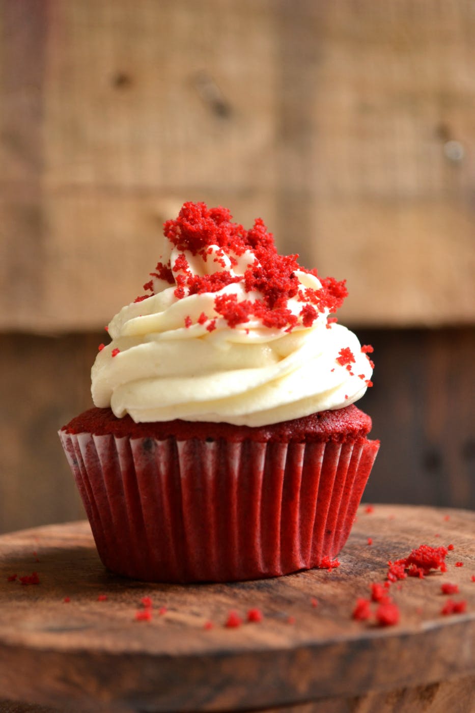
The Cupcake – Whimsical, Creative & Personal
Cupcakes are tiny, customizable pieces of edible art. Whether they’re topped with mountains of frosting, filled with gooey centers, or decorated with intricate designs, they always bring a smile. Cupcakes are fun, personal, and, let’s be honest, a little over-the-top in the best way.
If this is your pastry of choice, your web design style is quirky, highly personalized, and brimming with creativity. You love hand-drawn elements, playful typography, vibrant color palettes, and interactive design that feels uniquely "you." Your sites are the digital equivalent of a beautifully decorated cupcake—memorable, engaging, and filled with personality.
Think of brands like Etsy, Glossier, or creative portfolio sites. They break free from cookie-cutter design templates and embrace unique visuals, custom illustrations, and whimsical touches that make them feel approachable and human.
A cupcake-inspired website is all about storytelling. It invites users in, makes them feel at home, and gives them a sense of the person or brand behind the scenes. Every detail, from the button styles to the way content is presented, feels personal and crafted with care—because just like a great cupcake, a great website should be an experience, not just a transaction.
The Biscotti – Functional, Reliable & No-Nonsense
Biscotti may not be the flashiest pastry, but it’s dependable, sturdy, and built to last. It doesn’t crumble under pressure, pairs well with coffee (a huge plus), and serves a practical purpose—giving you just the right balance of sweetness and crunch.
If biscotti is your pastry of choice, your web design style is likely straightforward, functional, and no-nonsense. You value clarity, efficiency, and structure over excessive aesthetics. Your websites don’t waste time on frills—they prioritize usability, clear navigation, and accessibility.
Think of government sites, educational platforms, or B2B companies that need to convey a lot of information quickly and efficiently. Their designs use neutral colors, clear fonts, and well-organized layouts that prioritize content over decoration.
Take The New York Times website—no excessive animations, no distracting pop-ups (well, except for the paywall), just clean, structured content designed for readability. Or think of an online university portal—no one’s expecting it to be flashy, but they do expect it to work seamlessly.
Biscotti-inspired design is all about longevity. It doesn’t follow fleeting trends; instead, it focuses on stability, accessibility, and functionality—proving that sometimes, simplicity is the ultimate sophistication.
What Your Clients’ Favorite Pastries Say About Their Design Preferences
Clients don’t always come in with a fully formed vision. Sometimes, they have a vague idea—“I want it to look modern but warm… sleek but inviting… fun but professional.” You know, the classic contradiction sandwich. But if you really want to get to the heart of their taste, maybe skip the branding questionnaires and just ask them what they like to eat.
Turns out, people’s favorite pastries might tell you everything you need to know about the kind of website they’re after. Let’s break it down.
- The Cupcake Client: They want something unique, custom, and brimming with personality. Expect a lot of “Can we make it more fun?” and “Let’s add a little flair.” They’ll gravitate toward playful typography, bold color choices, and interactive features that make their site feel more personal.
- The Biscotti Client: Efficiency is their love language. They want something straightforward, no frills, and built for long-term function. Expect conversations about page speed, accessibility, and “Just make it easy for people to find what they need.” They’re not here for fluff—they just want results.
- The Donut Client: They want a website that’s engaging, dynamic, and a little unexpected. Expect requests for animations, bold visuals, and an emphasis on user experience. “Let’s make it pop” is something you’ll hear more than once.
- The Wedding Cake Client: Presentation is everything. They want a showstopper, something that looks stunning and makes people say “Wow.” These are the clients who will send you a Pinterest board full of high-end branding and tell you they want something “elevated.”
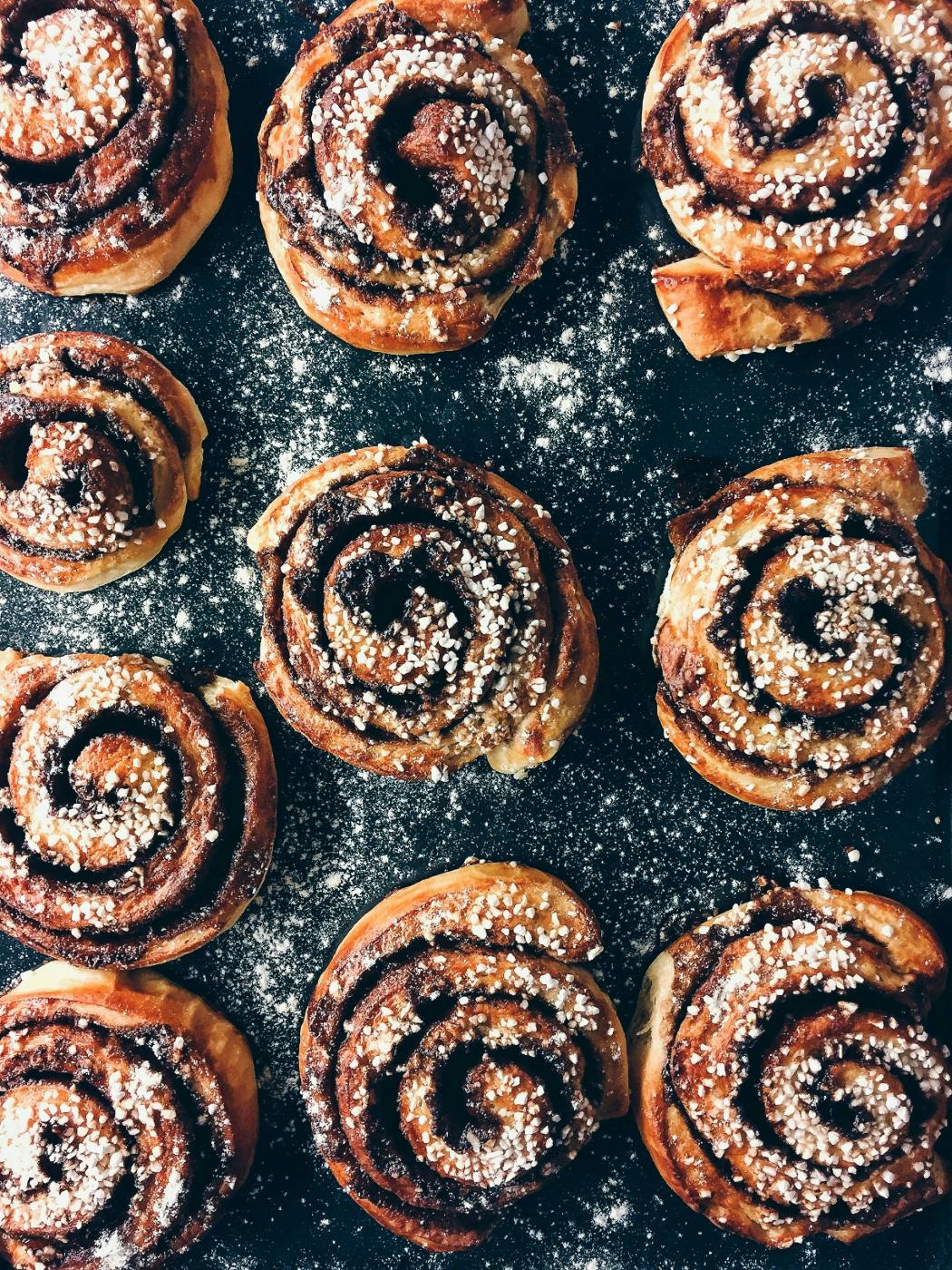
- The Cinnamon Bun Client: Warm, welcoming, and designed to make visitors feel comfortable. These clients want an inviting site that’s easy to navigate and has a touch of nostalgia. They’ll likely favor soft color palettes, conversational copy, and a layout that feels intuitive and friendly.
- The Bear Claw Client: They know what they want, and they’re not afraid to say it. Expect strong opinions, decisive feedback, and a preference for bold, structured design. They’re here to make an impact, and their site needs to reflect that.
Of course, not every client fits neatly into one pastry box, but it’s a fun way to think about how personal preferences translate into design choices. And who knows—next time you’re struggling to get a client to articulate what they want, maybe just ask them what their go-to bakery order is.
Summing Up
At the end of the day, whether you’re drawn to the refined simplicity of a croissant, the playful energy of a donut, or the unapologetic boldness of a bear claw, your taste in pastries might say more about your design style than you realize. Just like web design, baking is about balance—flavor, texture, and presentation all working together to create something that delights.
But what about the people who walk into a bakery, take one look at the endless rows of confections, and freeze up? The ones who like sweets but don’t know what they want? Or worse—the ones who claim they don’t like sweets at all? (We’re still trying to understand them.)
Those are the folks who need a little guidance. And that’s where ThoughtLab comes in.
If you’re not sure what your brand’s aesthetic should be, if you’re overwhelmed by design choices, or if you just keep saying “I’ll know it when I see it,” we can help. We don’t just find what works—we push our clients into new and exciting spaces they never even considered. ThoughtLab’s designers are fearless, bold, and skilled at turning creative sparks into full-blown experiences. Whether you’re looking for something familiar and comforting or ready to break all the rules, we’ll craft something that fits—and maybe even surprises you in the best way possible.
So, next time you’re feeling stuck, don’t stare at the bakery case in panic. Come to ThoughtLab. We’ll help you find exactly what you need—no sugar crash required.