From websites around the web we bring you UX design inspiration that'll make your head spin. These little details make a big impact.
“The details are not the details, they make the product just like the details make the architecture … it will be in the end these details that provide service to the customers, and give the product its life”. Ray and Charles Eames made that iconic statement in a promotional film about their “Eames Contract Storage” furniture system, an all in one dormitory furniture piece that transformed an ordinary empty room into a functional living space. I think this quote fits the field of user experience design even better than their murphy bed fit next to the desk.
In the current digital landscapes, poor design and lackluster attempts are littered throughout the world wide web like the bones of baby back ribs in a dumpster behind an Applebee's. It’s a mess, yet if you think about it, how we got into this position is really no surprise. We got here because agencies with a flat rate model are incentivized to finish a project as quickly as possible. Less billable hours mean higher margins and designers will quickly wear out the copy/paste buttons on their machines so poor designs and those lackluster attempts will abound.
This is the exact reason why we have decided to reject the flat rate model and have opted to run our agency as an hourly company. An hourly set up allows our designers to flex their creative muscles, and push the envelope without worrying about profitability.
In a continued effort to break up the mediocrity of the internet we’ve gathered a few of our favorite examples of clever UX design that will make even the most seasoned surfer of the web pause to appreciate.
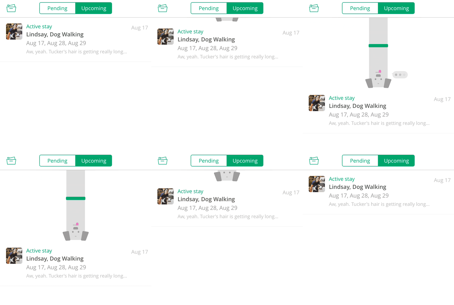
Rover
When you refresh a conversation in Rover an animated dog pops his head down with an iOS style speech bubble.
Trello
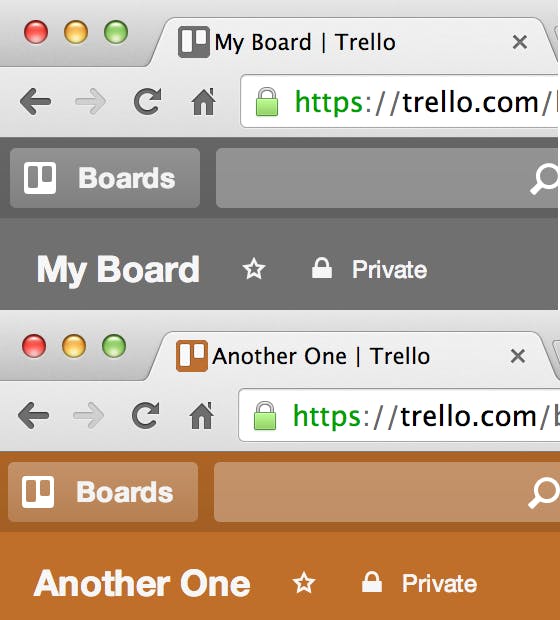
Trello changes the color of their Favicon to match the background color of the current board you are on.
Kayak
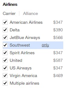
When hoovering over an airline Kayak lets you filter your search results to a airline with one click by clicking “only”.
Chrome
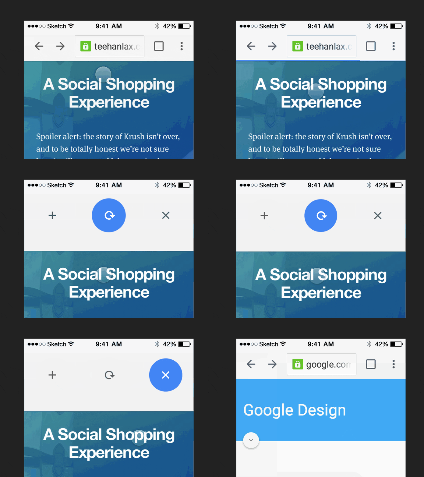
Chrome’s mobile browser has a pull to refresh with multiple options.
Google Maps
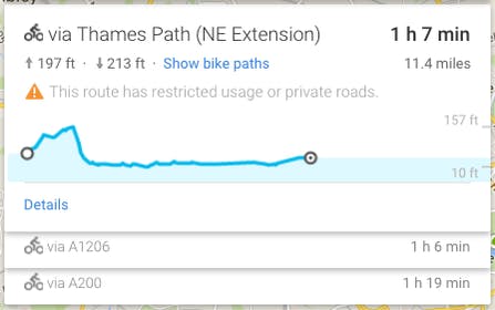
Map directions for bicyclists shows elevation change so you know how difficult your ride will be.
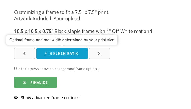
Level Frames
When ordering a frame, there is an option to pick a frame size based on the golden ratio.
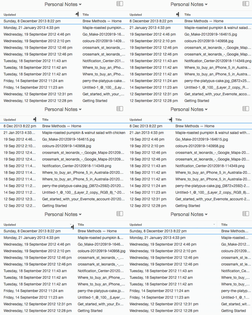
Evernote
Evernote will automatically convert the date format to what best fits the column’s width.
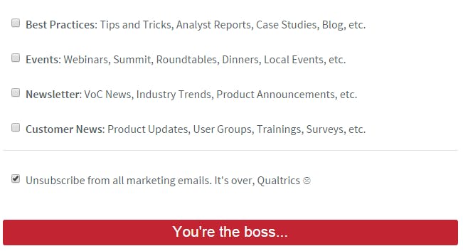
Qualtrics
When unsubscribing from the Qualtric’s newsletter the submit button changes to say “You’re the boss…”
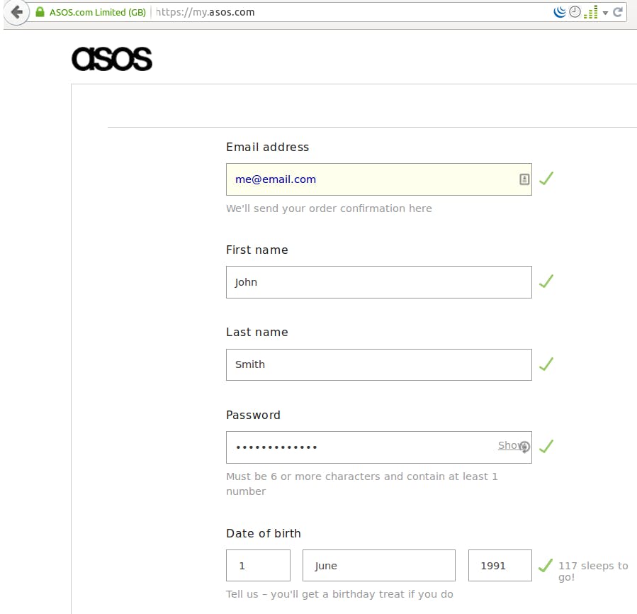
Asos
After providing your birthday, Asos will calculate how many days until your next birthday.
Medullan
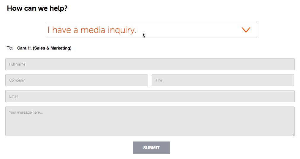
When filling out their contact form, it tells you exactly who will be receiving your email.
Mailchimp
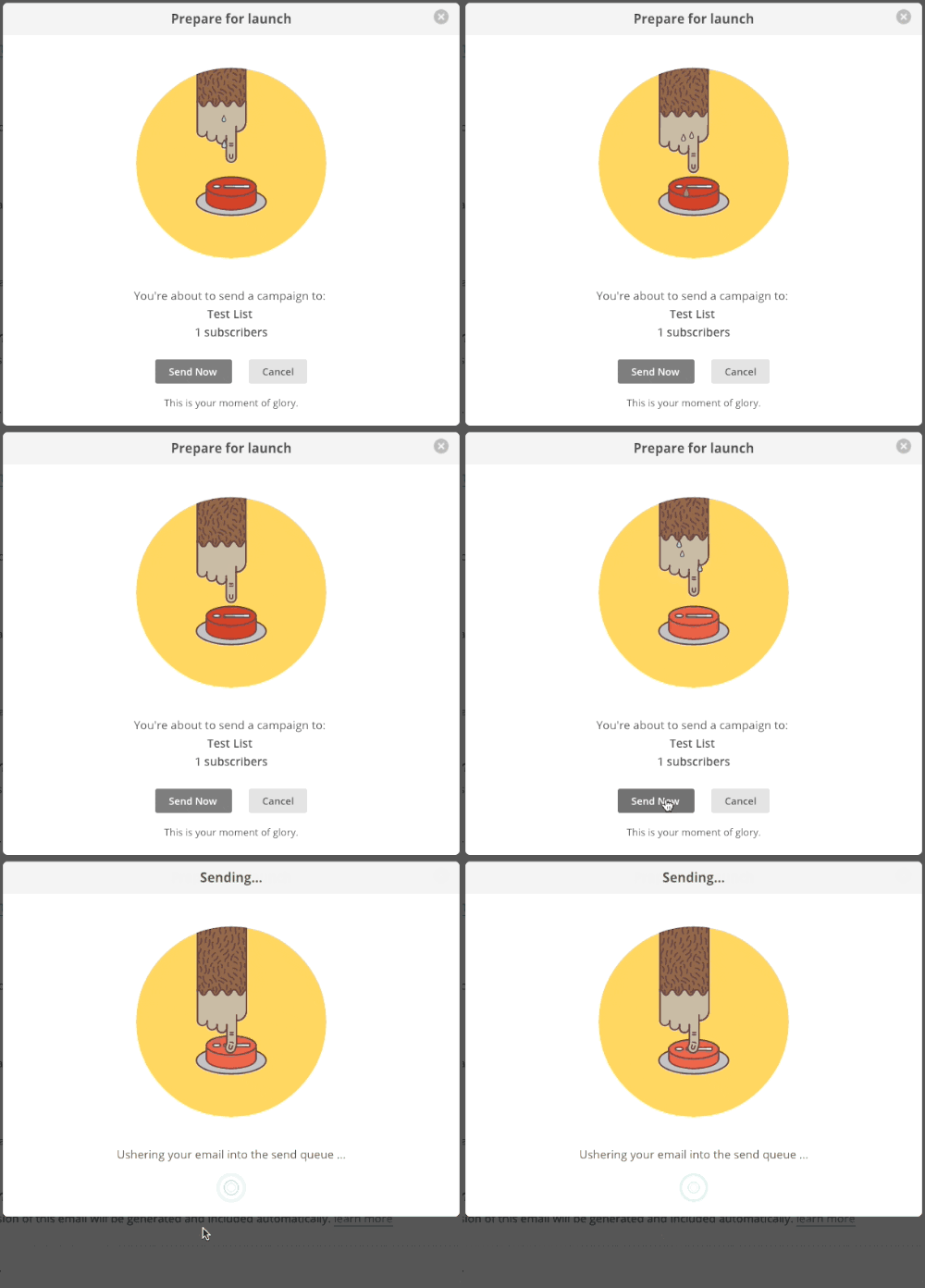
The animation Mailchimp uses right before a campaign is sent out shows how stressful it can be.
Tumblr
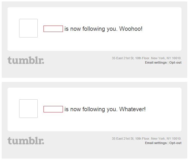
Tumblr’s new follower email notification says “John Doe is now following you. Woohoo!” If that person unfollows you, and then follows you again the second notification says "John Doe is now following you. Whatever!”
Slack
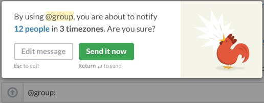
Before sending a group message to people in different time zones Slack will remind you that you may be waking people up.
Google Play Music
Google Play Music will skip a song if you give it a 1 star review.

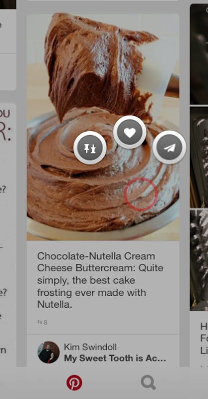
Pinterest iOS App
Tap & hold a pin to like, pin or share it.
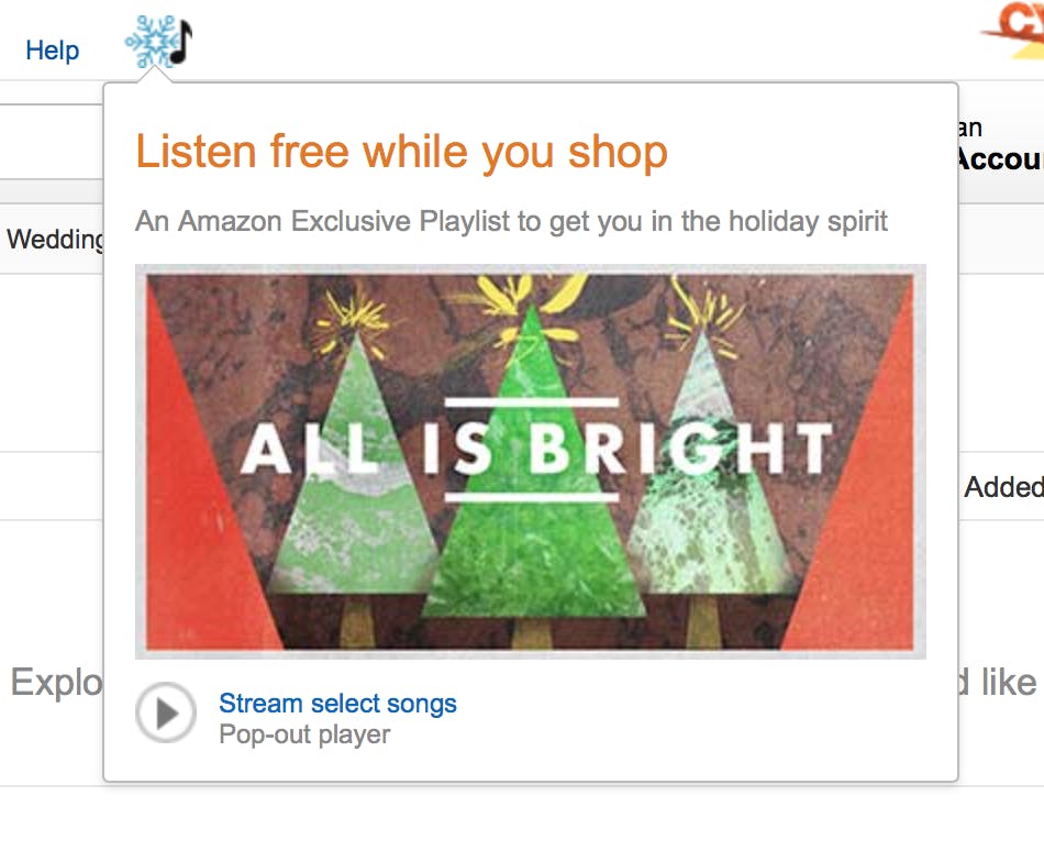
Amazon
Amazon mimics the real world by playing Christmas music on their site during the holiday season.
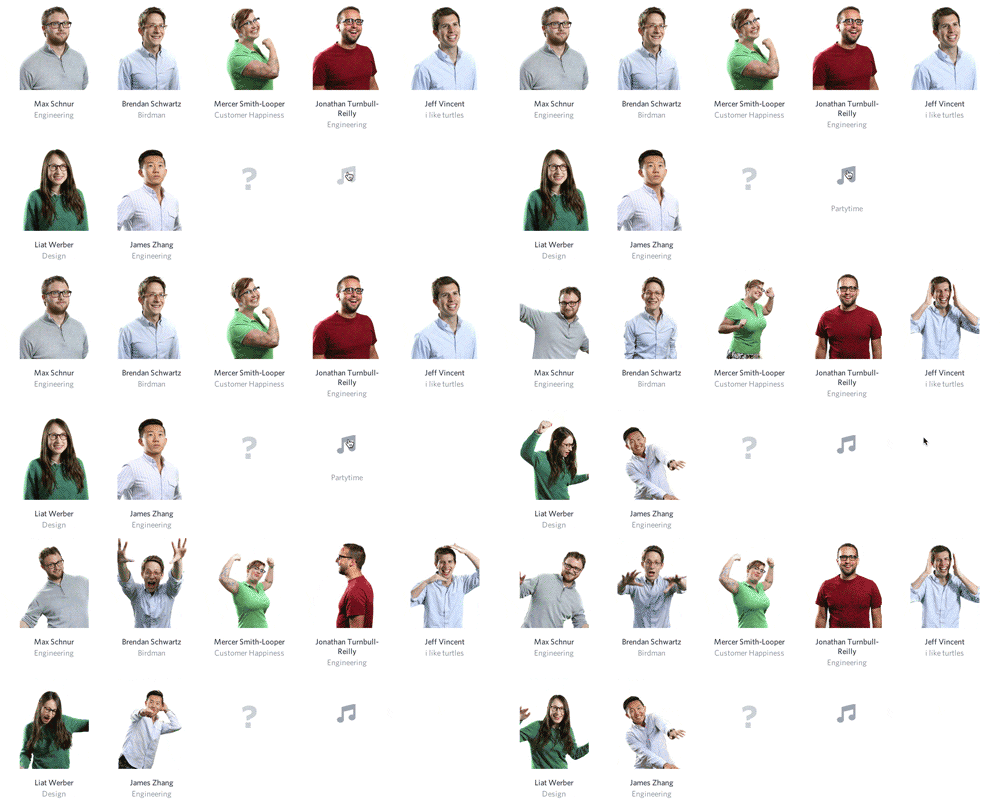
Wistia
Wistia’s team members will start dancing to swing music when the “Party Time” button is clicked.
It’s easy to copy/paste your way to a website. There are plenty of Youtube videos that will show you just how to do that. It’s simple. It’s lazy. On the other hand it takes time, energy and dedication to constantly sharpen your skills and create something that stands out from the pack. Something that is truly unique. Something worth while. It’s our hope that this list of stand out UX designs has dropped a heaping load of inspiration on your noggin’ and the next time you’re faced with a design problem, you’ll take the time, energy and the extra effort to create something truly great. Something inspired. Something beyond the copy/paste world of the accepted mediocrity.
Do you love great UX design? Good, so do we. We have a lot in common, why not drop us a line, say hi and send us your favorite example of great UX. Plus, if you ever need a creative agency, we’ve got you covered there too. Let’s see what we can create together. A big thanks to Little Big Details for compiling a cache of great designs and constantly being a source of inspiration.
