

You probably don’t spend much time thinking about fonts. After all, they’re just letters on a page, right? But what if I told you that fonts have a secret life of their own? That the typeface you unconsciously gravitate toward reveals more about you than you might expect?
The Secret Life of Fonts: What Your Type Choices Say About You
You probably don’t spend much time thinking about fonts. After all, they’re just letters on a page, right? But what if I told you that fonts have a secret life of their own? That the typeface you unconsciously gravitate toward reveals more about you than you might expect?
Typography is more than just aesthetics; it’s an unspoken language, a quiet influencer of mood, trust, and personality. From the carefully crafted serifs of Times New Roman to the bold, no-nonsense presence of Impact, every font has a story. And behind every story is a person—perhaps a person like you—who unknowingly chooses a font that aligns with their deepest instincts.
Fonts have evolved alongside human communication, from the carved inscriptions of ancient Rome to the intricate metal type of Gutenberg’s printing press and, finally, to the pixel-perfect typefaces of the digital age. But as much as they’ve changed, one thing remains true: Fonts shape the way we read, feel, and even express ourselves.
So, what does your favorite font say about you? Let’s find out.
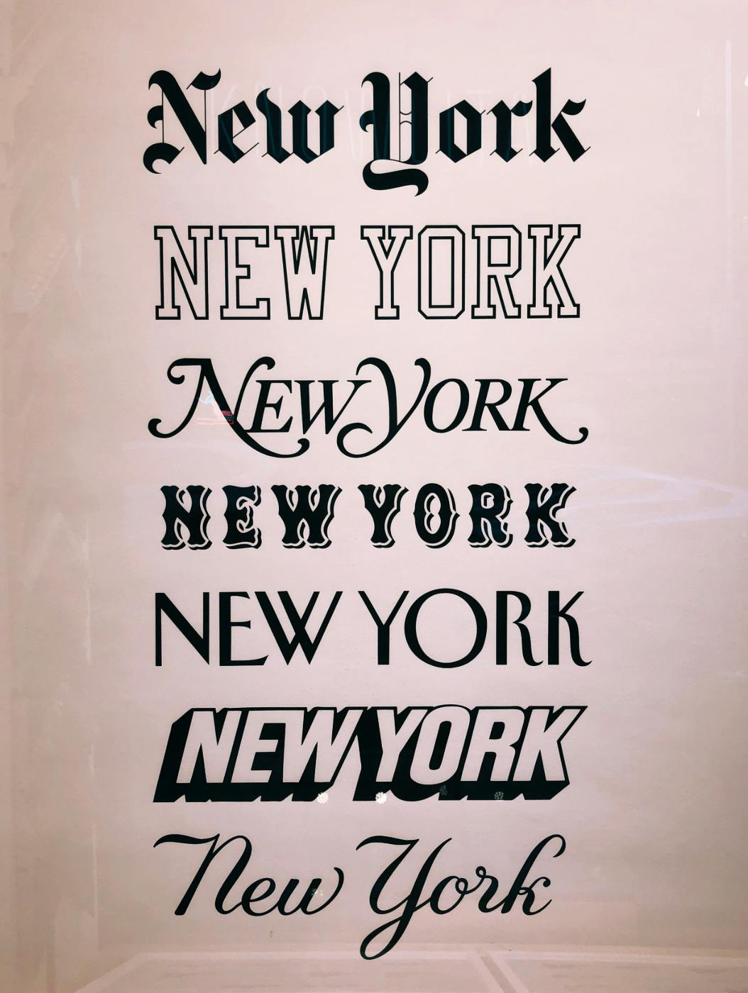
A Brief History of Fonts
Fonts have come a long way since the earliest days of written communication. From handwritten scripts in illuminated manuscripts to the precision of modern digital typefaces, the evolution of fonts tells a fascinating story—one filled with innovation, artistry, and sometimes, necessity.
- The Gutenberg Era (1450s): The invention of the printing press by Johannes Gutenberg revolutionized typography. For the first time, books could be mass-produced, and early typefaces like Blackletter were designed to mimic the handwritten manuscripts of the time. But soon, other typefaces followed. The emergence of Garamond in the 16th century refined type with elegance and legibility, moving away from the dense, gothic look of earlier styles.
- The Age of Enlightenment & the Birth of Modern Type (1700s–1800s): As literacy spread and the demand for printed materials grew, typography adapted. Transitional and modern serif fonts like Baskerville and Bodoni emerged, bringing cleaner lines and greater contrast between thick and thin strokes. These fonts reflected the intellectual and scientific advancements of the time, where clarity and precision were paramount.
- The Industrial Revolution (1800s–1900s): The rise of mass production and advertising created a need for bolder, more eye-catching type. This era saw the birth of slab serifs (like Rockwell) and the earliest sans-serif typefaces, such as Akzidenz-Grotesk. These fonts were designed for posters, headlines, and packaging, emphasizing impact over tradition.
- The Mid-20th Century & the Rise of Corporate Identity (1950s–1970s): With the explosion of branding and mass media, typography became a crucial tool for companies to establish identity. Helvetica, created in 1957, became the quintessential modern font—neutral, clean, and universally applicable. Fonts were no longer just about readability; they became symbols of corporate trust and contemporary design.
- The Digital Age (1980s- Present): The rise of computers and digital publishing transformed typography, making fonts more accessible and customizable than ever. The introduction of TrueType fonts in the 1990s gave users more control, while web fonts revolutionized online design. Today, typography continues to evolve with variable fonts, responsive design, and an endless array of choices tailored for print, web, and mobile devices.
Through these shifts, fonts have done more than just keep up with technology; they have shaped the way we consume information, express ourselves, and even define our cultural moments.
And with that in mind, let’s take a look at some of the most influential fonts and what they say about the people who use them.
The Top Five Fonts and Their Personalities
While there are thousands of fonts in existence, a few have stood the test of time as universally recognized and widely used. Here are five of the most iconic fonts and what they say about their users:
1. Times New Roman – The Traditionalist
You’re a person of discipline, order, and quiet authority. Times New Roman is the font of choice for academia, official documents, and serious literature, and if this is your font of preference, you likely appreciate a structured and well-organized life. You respect history and tradition and find comfort in the classics—whether that’s a leather-bound novel, a neatly pressed suit, or an old-school etiquette guide. You may not be the flashiest in the room, but when you speak, people listen. Dependable and pragmatic, you value intellect over trendiness.
2. Helvetica – The Modernist
Helvetica users are effortlessly stylish, drawn to minimalist aesthetics and modern design principles. If Helvetica is your font, you likely appreciate clean lines, open spaces, and the power of understatement. You’re the kind of person who can walk into a room and make a statement without saying a word. With roots in Swiss design, Helvetica is the go-to choice for brands that want to appear sleek, professional, and timeless—think Apple, American Airlines, and even the New York City subway system. If you love this font, you’re probably a perfectionist with an eye for simplicity and an appreciation for good design, whether that’s in architecture, fashion, or a well-balanced cup of espresso.
3. Comic Sans – The Free Spirit
You don’t care for convention, and you certainly don’t take yourself too seriously. If Comic Sans is your font, you value fun, energy, and playfulness over rigid formality. Often associated with children's materials, classroom notices, and lighthearted communication, this font is a favorite of teachers, creative minds, and people who prefer an informal, friendly touch in their writing. Love it or hate it, Comic Sans refuses to conform, and neither do you. You embrace life’s quirks and don’t worry about following the crowd—after all, where’s the fun in that?
4. Courier New – The Nostalgic Thinker
If Courier New is your font of choice, you might have a love for vintage aesthetics, storytelling, and the written word. This typewriter-style font evokes an era of classic journalism, old Hollywood screenplays, and carefully typed letters sent by post. You may be drawn to nostalgia and find comfort in the past—whether it’s through vinyl records, black-and-white films, or a well-worn notebook. You appreciate the art of communication and might be a deep thinker, a writer, or someone who values authenticity over modern polish.
5. Arial – The Pragmatist
Arial is the no-nonsense, get-things-done kind of font, and if it’s your choice, you likely embody that same practical mindset. Clean, readable, and straight to the point, Arial is used everywhere—from corporate reports to government documents—because it’s efficient, clear, and reliable. If you love Arial, you probably enjoy simplicity, organization, and a well-structured day. You prefer function over flair and believe that efficiency is key to success. Some might call it a ‘safe’ choice, but you see it as a smart one.
Fonts, like people, have their own distinct personalities. Some are bold and attention-seeking, while others are understated and refined. Whether you gravitate toward a sleek modern typeface or a playful and expressive one, your font choice says more about you than you might think.
But how have fonts adapted to different mediums over time? The transition from printed books to digital screens has brought both challenges and innovations in typography. We now turn to the ways in which fonts have adapted over time, moving from the permanence of print to the flexibility of the digital world, shaping the way we interact with text in an increasingly screen-driven age.
How a Font is Created: From Concept to Digital Form
Behind every typeface is an intricate design process blending artistry, technical precision, and even a bit of psychology. Fonts are more than just letters—they have personality, function, and a purpose. Here’s a closer look at how a font is born:
1. Concept & Inspiration
A new typeface begins with an idea. Some designers seek to modernize an old classic, while others create fonts that solve specific design challenges, like readability on digital screens or creating a distinct brand identity. Inspiration can come from anywhere—historical manuscripts, architectural forms, or even the curves of nature. Before a single letter is drawn, designers ask: What should this font say? Who will use it? Will it be elegant, authoritative, playful, or utilitarian?
2. Letterform Design & Refinement
With a concept in mind, the real artistry begins. Designers sketch individual letterforms, either by hand or digitally, carefully crafting the shape, proportion, and overall balance of each character. This stage requires meticulous attention to detail—every curve, serif, and stroke thickness must be harmonious across the entire alphabet. The goal is consistency while maintaining a unique visual identity. Design software like Glyphs or FontLab is commonly used to refine the characters and create variations like bold, italic, and condensed versions.
3. Spacing, Kerning & Legibility Testing
A well-designed font is not just about the letters themselves but also about the spaces between them. Spacing (how letters sit within words) and kerning (adjusting the space between specific character pairs) determine how smoothly a font reads. A single miscalculated gap can throw off an entire paragraph’s readability. Testing is crucial, with designers fine-tuning spacing across different applications—print, digital screens, and various resolutions—to ensure maximum legibility.
4. Encoding, Formatting & Finalization
Once the design is perfected, the font is encoded to function across operating systems and software. Each letter and symbol is mapped to a specific digital code, ensuring that when you press a key, the right character appears. Fonts are then packaged into formats like OpenType (.OTF) or TrueType (.TTF), allowing them to be installed and used worldwide. Many fonts undergo further refinement after real-world testing before they are officially released.
The Art Behind the Letters
The process of creating a font is a blend of science and art. Every typeface carries the fingerprint of its designer, subtly influencing the way we interpret written words. Whether it’s a clean, geometric sans-serif used in corporate branding or an elegant, flowing script evoking romance, fonts are an essential yet often unnoticed force in design and communication.
While we don’t consciously analyze fonts in our everyday lives, they quietly impact our perceptions, emotions, and decisions. The next time you open a book, browse a website, or glance at a billboard, take a moment to appreciate the careful thought behind the letters in front of you. Fonts, after all, are more than just text—they’re the voice of the written word.

The Psychology of Fonts: How Type Influences Perception
We often think of fonts as simply a matter of style, but they carry an immense psychological weight. Fonts influence how we perceive a message—whether it feels trustworthy, urgent, playful, or professional. Advertisers, designers, and brands understand this well, carefully selecting typefaces to shape consumer responses.
Serif Fonts: Trust and Tradition
Serif fonts, like Times New Roman, Garamond, and Georgia, convey a sense of history, stability, and credibility. These fonts are commonly used by law firms, newspapers, and financial institutions because they project reliability and tradition. If you see a serif font, you’re more likely to associate it with expertise and authority.
Sans-Serif Fonts: Modern and Minimalist
Sans-serif fonts, such as Helvetica, Arial, and Futura, are clean, modern, and approachable. These fonts are often used by tech companies, startups, and brands that want to appear cutting-edge and user-friendly. The simplicity of sans-serif typefaces makes them ideal for digital content, where clarity and legibility are key.
Script Fonts: Elegance and Creativity
Script fonts, like Lobster, Pacifico, or even calligraphic typefaces, add personality and sophistication. These fonts are commonly used in wedding invitations, luxury branding, and artistic projects because they evoke emotion, elegance, and a sense of uniqueness. However, their ornate nature can sometimes make them harder to read in long-form content.
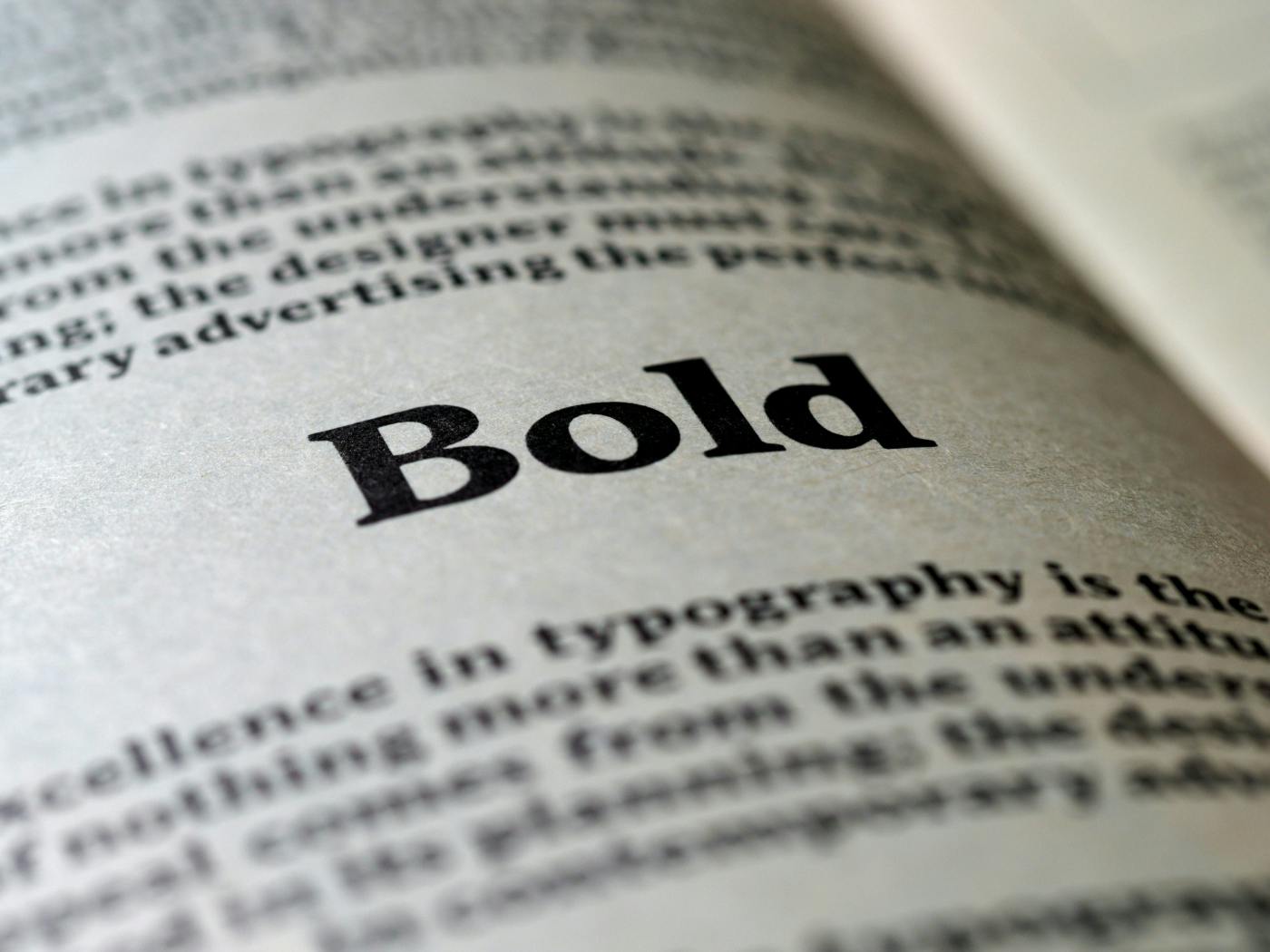
Bold Fonts: Strength and Urgency
Fonts like Impact, Bebas Neue, and Franklin Gothic scream for attention. These fonts are commonly used in headlines, advertisements, and warning signs. Their strong presence creates a sense of urgency, making them ideal for marketing campaigns that need to grab attention instantly.
Rounded Fonts: Friendliness and Approachability
Rounded fonts, such as Comic Sans, VAG Rounded, or Poppins, create a sense of warmth and friendliness. Companies that want to appear approachable and user-friendly often use these typefaces, as they evoke a casual, inviting tone. They work particularly well for children’s brands, educational content, and social media-friendly designs.
Fonts are not just design choices; they are psychological tools. The next time you see an advertisement, a book cover, or a website header, take a closer look at the typography. Chances are, it’s working on a subconscious level to shape how you feel about the message.
Summing Up: Fonts as Identity, Design, and Innovation
Fonts are more than just text on a screen or paper—they are an extension of personality, emotion, and brand identity. Whether steeped in history like Times New Roman or embracing a bold modernism like Helvetica, fonts influence the way we absorb and interact with the world around us. They are the silent but powerful tools of communication, persuasion, and design.
At ThoughtLag, we understand the power of typography. Our team has designed custom fonts for clients seeking a unique visual identity—fonts that capture their brand’s essence and speak to their audience on a subconscious level. Whether it's creating sleek, digital-friendly typefaces or crafting fonts that exude heritage and trust, we are passionate about the intersection of typography and storytelling.
Typography is evolving alongside technology, design trends, and the needs of modern communication. What does the future hold? More personalization, more adaptability, and even smarter fonts that adjust dynamically to user preferences. But one thing will always remain true: the font you choose—whether consciously or not—says something about you.
So, what does your font choice reveal? We’d love to hear your thoughts!
