The first installment in an every growing series that will teach you the basic fundamentals of running an ecommerce website.
No matter how hard you try, you can't turn back time. Cyber Monday, and the rest of The Holiday Season is looming over us much like the way your estranged uncle looms over the plate of candied yams at Thanksgiving dinner. Likewise, just how having your Uncle hover over the yams makes you nervous, the threat of missing the great opportunity that is Cyber Monday makes the proprietors of online stores get the shakes. It is that collective fear that inspired this short blog series. Thats right, this holiday season we’ve decided to forgo the traditional fruit cake and give you the gift of ecommerce success. This is the first installment in a series of posts dedicated to providing even the biggest digital noob a basic understanding of fundamental features every digital storefront needs to include.
Display a Coupon Code On Your Site <br />Google search trend data makes it abundantly clear that a good discount is an important decision maker for many holiday shoppers. Each year near the end of November till the middle of December search queries for “Coupon Code” and related phrases see a huge uptick in volume.

People don’t want to spend more money than they have to. Its common nature to leave a tab open on the checkout screen while looking for a coupon code, or cheaper product in another window. Take away any price anxiety your customer may be feeling by displaying the coupon code up front. The website WomanWithin.com does a great job of this.
The second you land on their website you're aware of what deals are available, how good those deals are, and how to get them. No leaving site to search various deal aggregators.
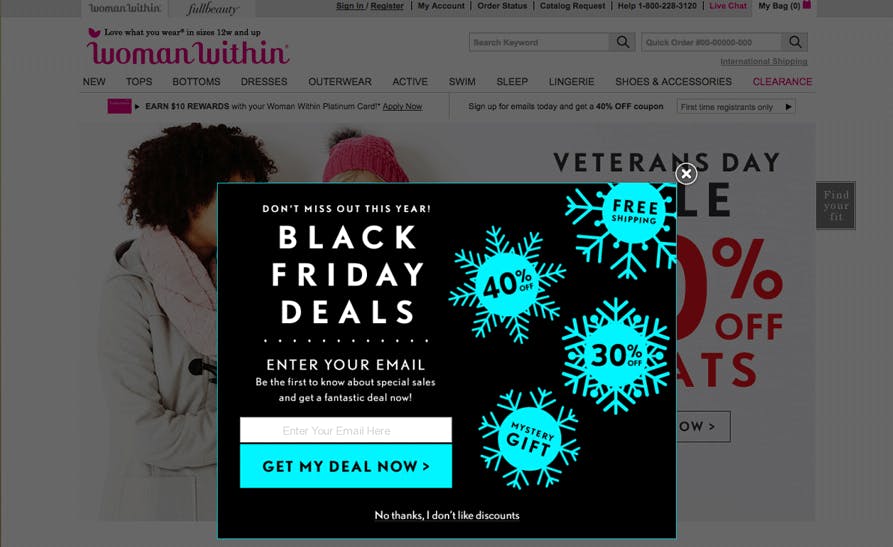
Woman Within has added a constant reminder of how to get their deals. No need to bounce at checkout.
Add Social Proof <br />I consider myself a brave person, but when it comes to spending $14.99 on solar powered christmas lights I get terrified. I mean I may think these lights looks really nice, but let's be honest I really have no idea what goes into making solar Christmas lights, let alone which brands have a good reputation. What if I buy this string of lights, spend all that time hanging them up, only to have them break the first time they get wet? My house goes dark, the neighbors accuse me of being a grinch and I slump into a serious case of seasonal affective disorder. No one wants to waste time with junk products. Help reassure your customers that your products are great by highlighting user reviews, awards, ratings and testimonials for your products.
For a great example of this take a look at one of our website design clients, ShopHushBaby.com. Hush Baby came to us for some SEO, and an ecommerce redesign. After refreshing the website's design it does a great job of building social proof in many ways, one of which is by clearly displaying their aggregate 5 star rating above the fold.
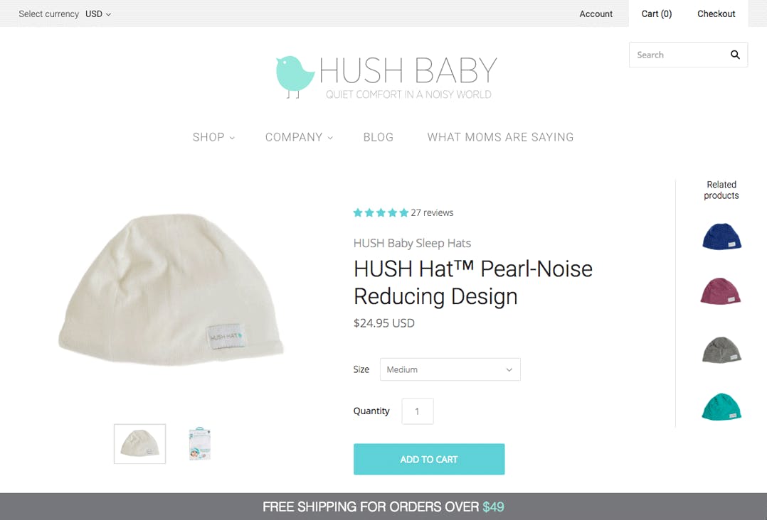
Below the fold full text reviews are displayed, leaving no doubt that customers to be, will love their product.
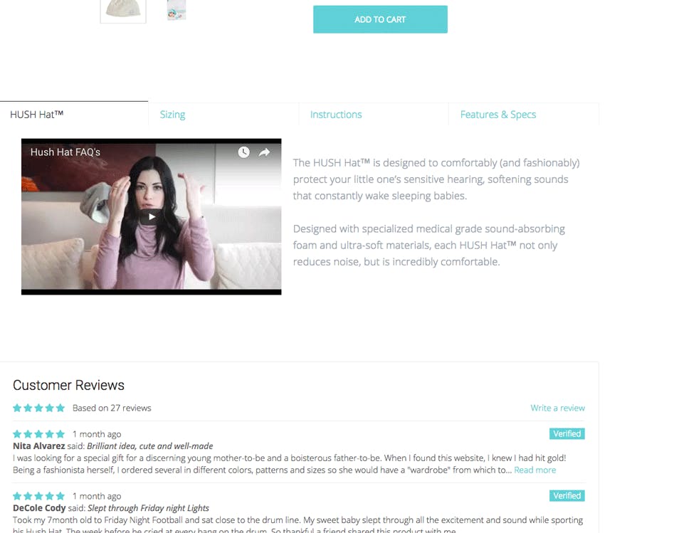
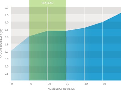
All hail the power of good reviews!! A good rule of thumb to strive for is 10 5-star reviews per product.
If you'd like a second set of eyes on your ecommerce site contact us, and we'll be happy to complete an audit of your existing site.
Shipping speed <br />Many holiday shoppers, myself included, are known to be last minute patrons. The anxiety I feel thinking I may show up to a holiday affair without a gift is tremendous. It is that thought alone that nearly convinces me to brave the mall, and throw some blows with Martha from down the street in a Hail Mary effort to get my hands on that last tea infuser left in stock.
Save myself, and your customers the trouble of squaring up at ‘Walmart’s Battle Royal’. Instead conveniently offer, and prominently display expedited shipping options. According to Business Insider shipping cost, and timing make up the majority of reasons an online shopping carts are abandoned.
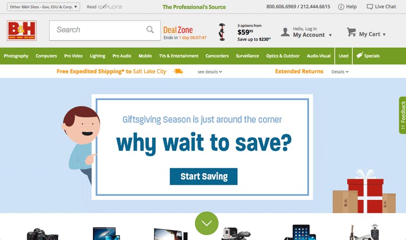
For an excellent example of a company easing shipping concerns take a look at B&H Photo. B&H is well respected for its great ecommerce design and usability. It may not be the prettiest, but they do a lot of stuff spot on. I’d highly recommend perusing their site for CRO inspiration.
B&H prominently displays their free expedited shipping option.
That does it for this installment of ecommerce fundamentals. Take a look at our second installment of Ecommerce Fundaments to learn how to utilize transactional emails and get more sales.

