
The most common e-commerce conversion hurdles and how to overcome them. Follow these tips to optimize your website for a higher conversion rate.
No matter what type of marketing campaign you may be running, from social media, Google ads, or simply just SEO, you’ve probably looked for some kind of guidance on how you can increase your conversions.
Advice can vary heavily depending on the type of marketing you are doing, and it can be overwhelming to figure out where to begin, especially if you’re running a combination of campaigns.
So the question is... where do you start?
Even though each marketing campaign has its own platform and seemingly secret formula for success, there is always one constant denominator - your website. Let’s start there.
When it comes to your website, you may have unknowingly created extra steps or “hurdles” for your potential customers to jump through. These hurdles may cause visitors to second guess themselves, get frustrated, confused, and simply leave the site altogether.
So let’s review some of the most common conversion hurdles, and how you can fix them.
Pricing

This probably seems obvious, and we are definitely not saying you should just give your product or service away for free. Price, however, is the first thing that consumers look at during the buying process and the first thing that will cause them to leave if they find it too high or unjustifiable. So here are just a few things that you should consider when it comes down to deciding the right price:
What does it cost you? What goes into the item or service that you’re offering? Do you have to purchase materials, or pay a manufacturer? How much time do you put into it? Determining exactly what a product costs you to produce will help you set a baseline for your price.
What’s your profit margin? Of course, you need to make money. The question is how much money is within the acceptable range of what a customer is willing to pay, and how much you get to pocket away.
What is your market? Knowing your market, and market audience is so important when it comes to determining the right price. If you are in the wine business, for example, it would be important to know that on average, Americans will not spend more than $15 for a bottle of wine. Do your research, find out what people are currently paying, what they are willing to pay, and what your competitors are charging. All of these factors will help you determine what price point will work best for you and your consumers.
Test It. This is a recurring theme with any kind of marketing, and you’ll hear us say it frequently. Testing is at the core of determining what strategies and pricing work best for you and your target audience. Make sure that you are testing and tweaking everything until you see the results you need.
Shipping

Let’s face it, people are willing to pay for a lot of things; clothes for their dog, 11 pounds of applesauce, a new outfit for their video game character, the list goes on. Something that people are often not willing to pay for, however, is shipping. The average online shopper perceives shipping as an additional fee, and will often back out of the purchase due to this.
So what can you do?
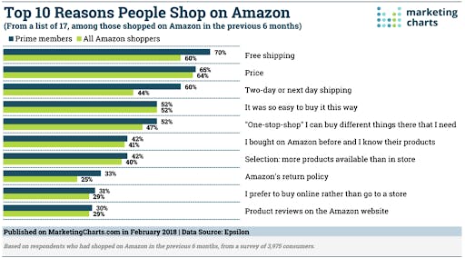
Offer free shipping: Shoppers are easily persuaded if they feel they are getting a deal, and let’s be honest - the power of free is monumental. In a study done by Epsilon, 60% of your average Amazon shoppers stated that free shipping was their primary reason for choosing Amazon, with the number being even higher at 70% for Amazon Prime members.

Free shipping may not be the secret to increasing your conversions, but it’s definitely something that persuades a lot of shoppers to buy.
Provide A Choice: Have you ever found yourself on an eCommerce site and noticed a banner advertising free shipping on orders over a certain amount? You then have to decide if you would rather add $10 more to your cart to hit that free shipping threshold, or if you just suck it up and pay for shipping. This is the kind of choice that you want to provide.
Shoppers feel better about adding more items to their cart than they do about paying for shipping.
This is just one example of the kind of choice we are referring to, and if you just keep your eyes peeled while browsing various sites, you may see some similar tactics being used, such as free shipping with memberships, loyalty programs, or email subscriptions.
Delivery Timeframe: Shoppers love free shipping, but what they don’t love is shipping that takes over 7-10 days to be delivered. If a package hasn’t arrived within a substantial amount of time they will likely not buy from you again, and potentially leave you a negative review.
So a couple of things:
First: Be clear and upfront about what kind of timeframes to expect for shipping and provide some options if they need it in a quicker amount of time.
Next: Provide tracking updates so your customer can always keep tabs on their package’s journey.
Lastly: Make sure that when you research logistics companies, you investigate their reputation to ensure it’s reliable.
Be Transparent: Not that you would go out of your way to hide shipping information and costs, but maybe they are not as prominently displayed as they should be.
For example, if your shipping costs are not viewable until after a customer enters their payment information, odds are you will experience a higher cart abandonment rate.
Why?
Because customers want to know exactly what they are paying before they enter their payment details. If they have to enter payment info first, customers likely just want to see what shipping prices are, and they don’t actually intend to purchase the item.
Make sure you have all of your shipping information visible before a customer has to enter payment details. You can do this easily by having a shipping calculator or simply just flat rate costs.
Checkout Process

Regardless of the simplicity of a checkout page, it can still be one of the primary pitfalls that cause cart abandonment. So let’s review some of the most common mistakes that can be made when it comes to checking out.
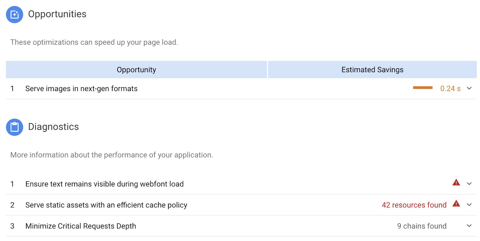
Site Speed: This isn’t specific to just the checkout process, but for your site as a whole. If it takes too long for a page to load, or for someone’s payment to process, they are likely to get frustrated, lose patience, and leave. There are a lot of resources out there to help get your site loading faster.
Google has a really great free PageSpeed Insights tool that you can use to check which areas of your site need improvement:

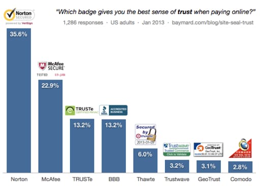
Security: There are a lot of ways to make sure you have a secure a site. The problem is, you’re not showing your customer how your website is secure. Consumers need to know that their information is protected before they hand it over to you. Some of the easiest ways to show site security are:
- Obtain an SSL certificate
- Add security badges to your site and checkout process

- Add familiar and secure payment options such as Paypal
- Use call to actions on your checkout page that mention "secure checkout"
These simple and actionable steps will help show your customers that their information is safe with you and will help to provide them with peace of mind.
Forms are too long: Don’t give your potential customers form fatigue by requiring them to fill out a bunch of useless information that isn’t required to make a purchase. If you’re asking for date of birth, gender, company name, phone number, or nickname, you’re probably asking for way too much information.
Customers want to get in, make their purchase and get out. The quicker you can make this process, the better. If you find that there is some information you’d like to obtain for purposes not related to checking out, you can find some fun alternative ways to gather those details. The most common example here would be getting a date of birth so you can send different promotions via emails for birthdays.
Account Required: Nothing will make a potential customer leave quite as quickly as this. Requiring a user to sign up for an account immediately interrupts the checkout process and causes you to rethink if it’s even worth the effort.
You’ve probably already noticed that a lot of eCommerce websites allow you to checkout as a guest. This is a great convenient option that new, and even repeat buyers, will choose to use. That doesn’t mean that you shouldn’t still have the option to create an account of course, but it’s all about proving choices. You can easily entice users to create an account by having some type of loyalty/rewards program or offer exclusive deals.
Copy

Copy can definitely make or break you. You don’t necessarily need to be an expert copywriter to have compelling copy, you just need to be knowledgeable about your market and what you’re selling.
You might be thinking: I am knowledgeable, so what am I doing wrong?
Let’s take a closer look:
Lack of detail: This can depend on the type of goal you are trying to achieve. Something as simple as gathering emails from website visitors shouldn’t require much in terms of copy. However, if you are trying to sell an expensive item, a customer is going to need a lot more convincing than just a few lines of text
So how much copy is enough?
There really isn’t a magic number when it comes to copy. As a general rule of thumb, the more information you can provide the better. Get into all of the nitty-gritty details on whatever it is that you are selling. The larger the price tag is, the more persuading someone will need.
Jargon: Industry jargon can be very confusing for people who are not familiar with it. Don’t risk confusing your customers with terms that they don’t understand. When writing copy, use simple terms that even a five-year-old will be able to understand. Your customers will thank you.
Being too general: When we mentioned previously that you need to get into all of the nitty-gritty details, we meant it. Go into all the specific details about your item, break down the numbers, mention dates, percentages, whatever you have. General claims are just that, claims. When you go into specific details you are now stating facts.
Not addressing fear: Consider what concerns someone might have about your product and find a way to address those concerns within your copy.
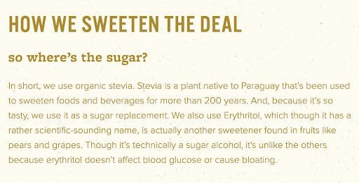
Let’s say you are the grocery store and you’re really craving something sweet and indulgent. The only problem is that you just started a new diet and you can’t afford to go over your calories for the day. Luckily there are some healthy options out there, but you still have a few concerns. Take Halo Top for example:


The first thing you see in large print is the calories. This isn’t for a single serving, mind you, it’s for the entire pint. So, if you happen to find yourself mindlessly eating while binge-watching Battlebots, you don’t have to feel guilty if you hit the bottom of the container.
They also clearly review what makes their ice cream low calorie, and explain what some of the scary-sounding ingredients are and how they affect your body.
Use your best judgment when trying to determine what sort of objections a customer might have about your product. Start with some basic core objections like price, quality or value, then drill down from there to find more specific concerns.
If you are unsure about what type of concerns a customer might have about your product or service, try to brainstorm with colleagues or friends to come up with some ideas. You can also research reviews on similar products to see what objections customers have as well as scope out your competition.
So there you have it. Keep in mind that avoiding these hurdles may not be the secret to suddenly increasing your conversions, but they will definitely help to improve your overall user experience and create happier customers.
