The simple truth is that copywriting has existed for hundreds of years. It is not a new fad that came into being with the advent of the internet and became more “refined” with the introduction of social media. As long as there has been a product to sell, a language to write, and people to sell to, there has been copywriting.
The simple truth is that copywriting has existed for hundreds of years. It is not a new fad that came into being with the advent of the internet and became more “refined” with the introduction of social media. As long as there has been a product to sell, a language to write, and people to sell to, there has been copywriting.
Claude Hopkins’ seminal book, Scientific Advertising, is still considered a classic in advertising, and it was published in 1923. One of the ways that we, as humans, learn is by example. We watch, read, listen, and follow in the footsteps of the masters to figure out the hows and whys of a craft and follow it.
If you’ve ever done any kind of martial arts and you’re familiar with a form, you know that it is basically walking in the steps of a great master in order to feel and follow how the blocks and strikes eventually came into being. It’s the way we learn.
Copywriting is not easy. There are many facets of it to be aware of, to master, and to make your own; understanding about status, how you rethink situations and finding your unique voice are all steps in being a better writer with something special to offer.
So, if you’ve come to this article looking for hints and ideas about how to be a great copywriter or even just a better one, there really is no better place to start than with the masters. Walk in their footsteps as it were and see what they did, why, and how their copy changed the medium. Here, we will take a quick look at ten examples of memorable copy that converted in no particular order.
Ten Examples of Memorable Copywriting that Convert
#1 - David Ogilvy, Rolls-Royce, 1959 Headline
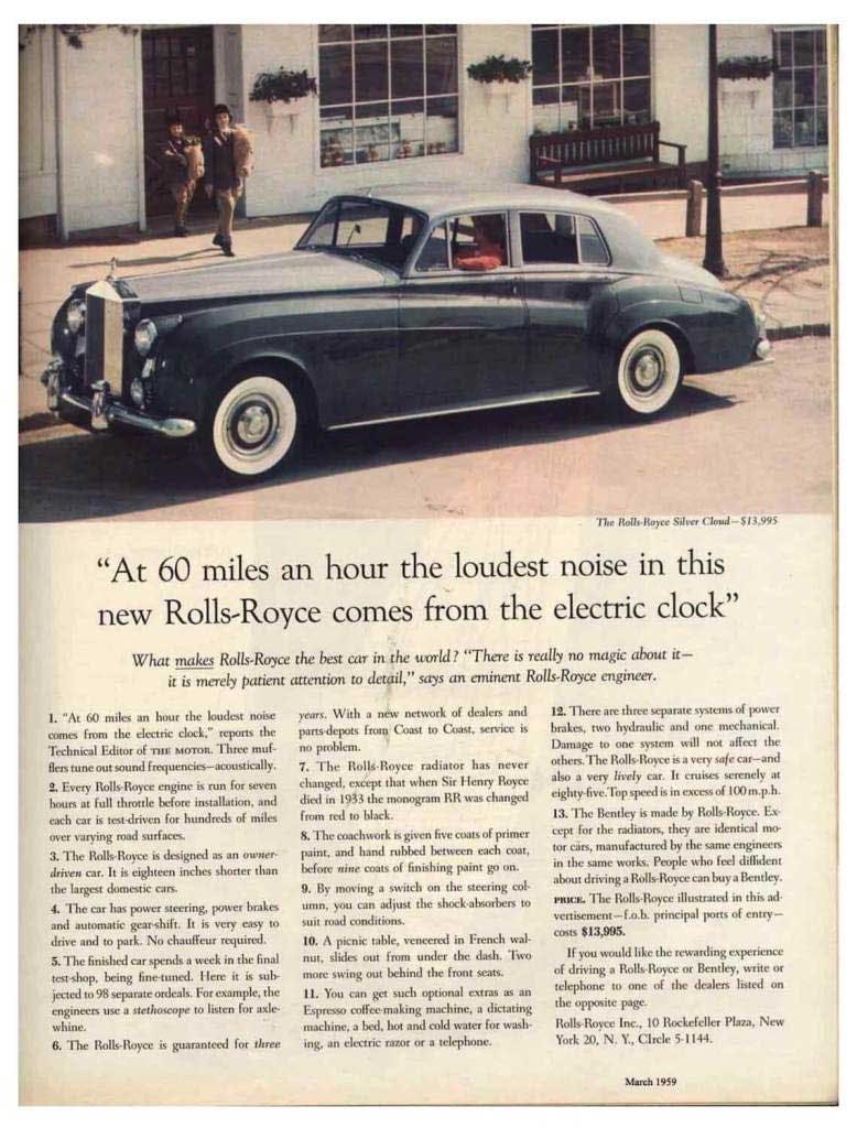
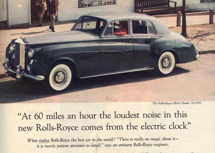
At 60 miles an hour, the loudest noise in this new Rolls-Royce comes from the electric clock.Quote:
David Ogilvy
We start with this one because you cannot talk about copy or advertising without at least one mention of the great David Ogilvy. Just read his 1963 wonder of a book, Confessions of an Advertising Man; you’ll learn a ton, have your mind blown, and get all your Mad Men needs fulfilled.
Ogilvy’s 1959 Rolls-Royce ad is memorable for a few things. He employs a lovely bit of implied writing which comes at you from a different angle rather than a straight shot to your face. He could have said; this is a quiet car, but he allows the reader to figure that out on their own with his picture painting details. The sound of an electric clock, the anchor beating on the escapement wheel. It’s a tiny sound that gets drowned out by the slightest daily noise. In your own house, you’ll notice that you have to be immeasurably silent to hear the ticking of a clock. Ogilvy nails the quietness of the Rolls in one sentence.
The body copy supporting the headline goes even further with this piece of copy: “For example, the engineers use a stethoscope to listen for engine whine.” You can claim the car is quiet, and then the customer chooses to believe it or not, but who doesn’t believe a stethoscope?
Ogilvy allows the consumer to create the pictures in their mind, and thus, they are consumed and subsumed into the car. The ad creates a complete immersion for the reader.
Another bit of genius here is that Ogilvy didn’t use anything but facts. He pulled all his copy for the ad from the technical Editor’s write-up in The Motor. Ogilvy gave no adjectives, just facts, no “gracious living” words. He let the car, the product speak for itself.
#2 - Ricola; She’s Just a (cough) Friend- 2014
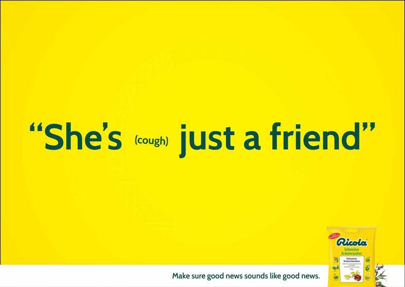
This one is fun and exciting for a few reasons. First off, it takes a dull subject at best and elevates it to a sexy, naughty, just on the edge of NSFW, and drops it squarely in the minds of everyone who has a cold and is perusing the cough & cold section of the local drug store.
The well-placed cough sends the sentence in a completely unexpected direction and just becomes a worm in the consumer’s mind.
Second, it is an excellent example of some slick, clever implied writing, which is always very strong and allows the consumer to be an active part of the copy.
This bit of copy that evokes and captures the reader, coupled with the brand’s well-known packaging and colors, creates an experience that had people chuckling in the medicine aisle and proving once again, laughter is the best advertising.
#3 - Volkswagon’s 1958 Think Small Campaign
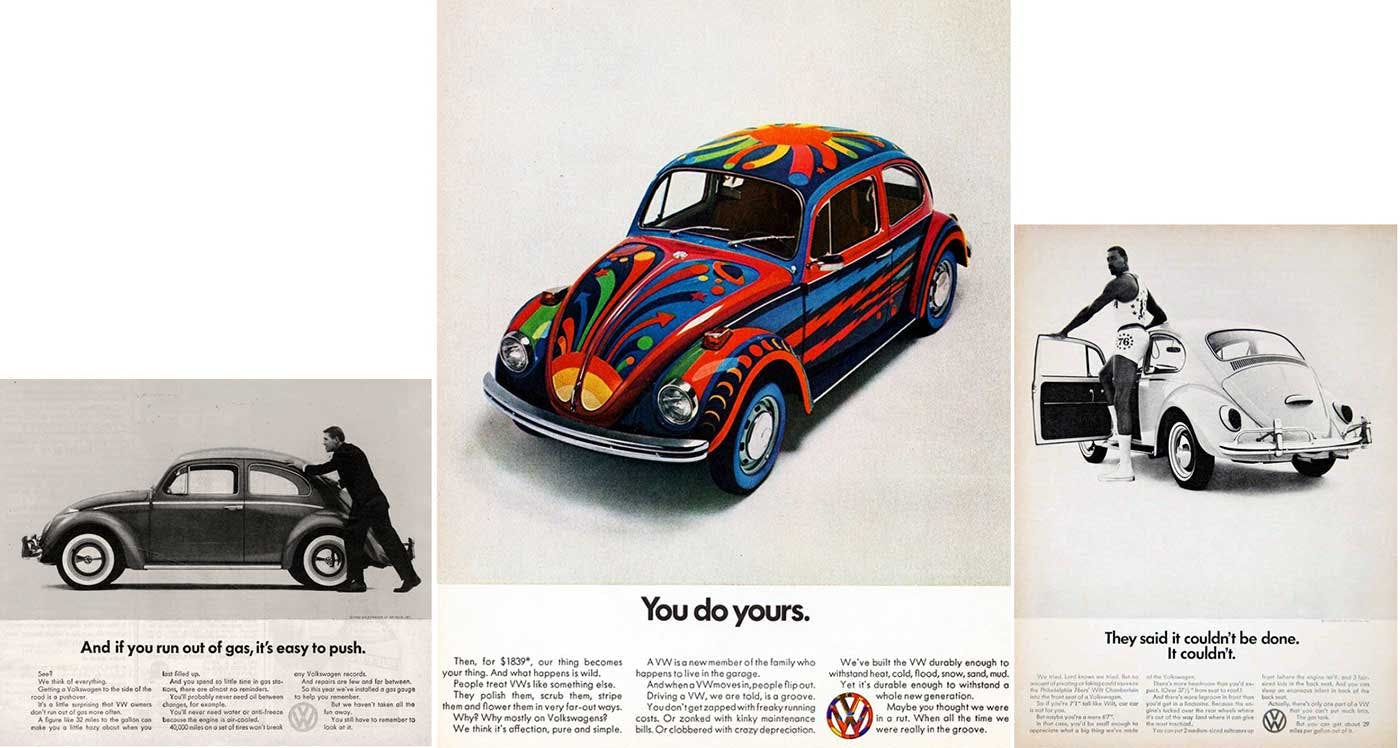
The superlatives have just rolled in on this one, from advertising magazines to a spot on Mad Men that had the notoriously unflappable Don Draper confounded. It was a breath of fresh air at the time and long after. Ad Age ranked this ad the best campaign of the century.
This is copy that took a look around, saw what the country was most obsessed with and then, flipped the script.
American was in the throws of muscle car mania, and big was the word. Big engines with massive horsepower, so the copy took into account all the best features of having a small car, better gas mileage, cheaper insurance, and less maintenance. No longer worshipping the big muscle machines, this campaign told readers to “Think Small.”
The ad was in black & white even though color was the standard, and the car points to the slogan, so the reader knows where to look, gets clear direction. Minimalist design and simple copy, the ad, and the product call attention to itself, and thus it is memorable.
It proves that knowing the customer’s perspective, in this case, muscle cars, big is better, and surprising them by subverting their expectations can leave a lasting impression. Small turned out to be pretty big.
#4 - Hiut Denim, 2011 Do One Thing Well.
This is one of the more recent examples on our list, and it gained entry due to the simplicity and honesty of the copy. Their values and brand story are clear all over their website. With copy that isn’t frilly or too selly like: “Do one thing well,” “We make jeans. That’s it nothing else” and “We make the best jeans we can. Not the most jeans we can.”
This style and approach may seem very now and hip, but nope, it’s been there for a long time. Understanding that consumers are smarter than advertisers gives them credit, and the consumer knows when they are being sold. Hiut’s copy is believable and shows very simply why their products are worth buying. They follow clearly in the steps of the master, Ogilvy, who said:
“The consumer isn’t a moron; she is your wife. You insult her intelligence if you assume that a mere slogan and a few vapid adjectives will persuade her to buy anything. She wants all the information you can give her.”Quote:
David Ogilvy
Hiut sees their customers as intelligent, and their copy perfectly reflects that.
#5 - Beachway, Addiction therapy and rehab center, 2010 “If you think you need rehab, You Do.”
This is a prime example of copy speaking directly to the consumer in the language they use. Words that have come from the mouths of addicts became part of the company’s advertising with impressive results.
When the center first opened, they used the slogan, “Your Addiction Ends Here.” Great idea, in theory, but, as any addict will tell you, they’ve heard that from counselors a million times before.
The copywriter looked at Amazon reviews of a book on addiction. She pulled language from addicts who were leaving reviews. These familiar words use existing mental representations, which is how our brains organize information. The change in slogan saw a 400% increase in clicks and a 20% increase in form submissions.
Using customer’s language lets you say what they are already thinking, and it feels magical in the level of how well you understand them. Listening helped, and it continues to help those who go to Beachway.
#6 - Pepsodent 1929; Film: A Dangerous Coating That Robs Teeth of Their Whiteness.
Pepsodent couldn’t give away a tube of toothpaste, but they realized it wasn’t their fault or the fault of the product when they looked around. Who’s fault was it? The unaware audience.
Statistics show that in 1929, only 7% of people brushed their teeth. They were unaware of gum disease or cavities that were associated with poor dental hygiene. So, the copy was written to address a specific pain point for a particular audience. There are five types of buyers you’re looking to reach:
- Unaware
- Pian aware
- Solution aware
- Product aware
- Most aware
The ad couldn’t just talk about the benefits of toothpaste because people didn’t even know they needed toothpaste. The ad speaks of “Film” on the teeth and says if you run your tongue over your teeth, you’ll feel it right away. AND PEOPLE DID.
The ad caught their attention, made them aware of a problem they didn’t know they had and offered a solution to it. The copy was simple and created a picture in the consumer’s head that they immediately had an action associated with, running the tongue over the teeth. It was gold.
#7 - Sunkist “Drink an Orange” 1916
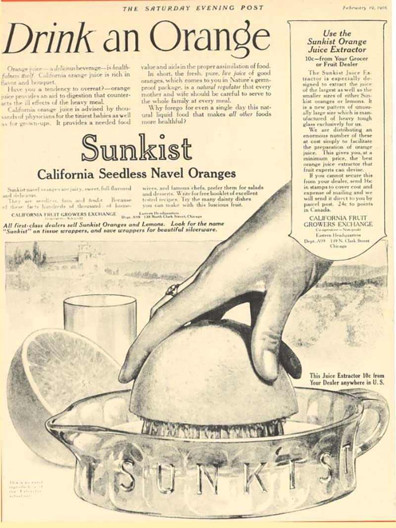
You’ll have to have Sherman set the Way-Back machine for this one but, it’s worth the trip. This ad launched a major corporation, introduced a vitamin, and saved an industry.
Now, Sunkist is a mega-brand and is known worldwide. But, back in the early 1900s, not so much. Orange growers were producing more oranges than the public was buying. In fact, they were on the edge of cutting down trees just to break even; enter Albert Lasker, advertising genius.
Lasker looked at the situation and came up with a brilliant solution. First, he patented an orange juicer, sold it for .10 cents a pop, and then launched the “Drink an Orange” campaign. The ad introduced vitamin C to moms and the goodness of the vitamin for growing bones. And, it was convenient to get the kids to drink a glass of cold OJ and get those needed vitamins; all they had to do was “Drink an Orange.”
The upshot? Orange groves grew by the acre, people bought oranges by the case, and Sunkist became the mega-brand we all know today. That’s good copy, good and good for you.
#8 - Miss Clairol hair coloring 1956 “Does She … or Doesn’t She?”
This ad spoke directly to the problem with making a change, specifically trying to look younger. People want the difference; however, they don’t want anyone to notice the change or question if it’s fake. These days, it’s liposuction. Look at all the inches I’ve lost, but don’t look at the lipo scars.
This was and still is a problem encountered by women who get their hair colored. Although with the rise of pronounced hair colors, blue, pink, purple, it may be less of an issue for some. Others still don’t want to announce they had the grey taken out.
The ad assuaged the fears of being discovered while stressing the natural look of the coloring. The copy and the line; “Only her hairdresser knows for sure” connect to the little secrets women share with their best friends or intimates like the hairdresser.
The tag “Does She or Doesn’t She” was used and reused later with the “Does She or Doesn’t She … She Still Does” campaign extension years later, targeting an older generation who looked and felt younger. And it became part of the vernacular of the time.
#9 - Lion Matches 1924 “It’s Easy to See I’m Not in it for the Money.”
This is one of the oldest examples on our list, and it got here by being brilliant in simplicity.
Lion took an ordinary, everyday object with their matches that people didn’t even give a second thought and made it seem like the most valuable product in the world. They gave their product a personality, point of view, and a voice.
The copy was, here’s that word again, simple:
I light cigarettes, cigars, pipes, candles, lamps, fires, stoves, fridges, geyser, Christmas puddings, and distress flares, and I cost three-hundredths of a cent.Quote:
Lion Matches
At the time, everyone used matches to light everything. Lion gave them a story and underscored how valuable the little match was. No one could strike a match in 1924 without
thinking about how life would be less interesting, bright, and warm without the little Lion match. Enlightening copy.
And, number ten, one of our all-time favorites:
#10 - California Milk Processor Board 1993 “Got Milk?”
It was a simple question that rocked the advertising world back on its heels and never allowed them to rock back.
This was advertising turned pop culture, utilizing stars from TV, film, sports, animation, all asking that simple question, “Got Milk?”
Building on the force of a previous campaign, “Milk does a body good,” this version uniquely flipped the script. What the copy did with the small question and the supporting material was to make the stories we tell ourselves about milk, winning 100,000 dollars, having the best midnight snack ever, and so on, more important than the milk itself. So, they didn’t actually sell milk as much as they sold the stories around milk.
The ad exploded on tv screens with the now infamous Aaron Burr commercial where we see an Aaron Burr expert miss an opportunity to win 100,000 dollars because he has stuffed his face with a peanut butter sandwich and when the radio DJ asks him to answer a trivia question, the answer being Aaron Burr, he reaches for the carton of milk to help him swallow the PB sandwich and …. He’s out of milk. No milk, no money. The commercial ends with the black screen and the simple question in white letters; “Got Milk?”
The Aaron Burr commercial and that simple bit of copy is an ad-world cultural touchstone that has rarely if ever been successfully remastered. Interesting side note, the commercial was directed by Micheal Bay. Yup, that Micheal Bay, of Transformers, Bad Boys, and The Rock to name a scant few, fame.
These are great examples that have been inspiring to copywriters for decades. Look to them and learn from them but remember, you’re not now, nor will you ever be Ogilvy. That’s okay; he was one of a kind, and so are you. So, be inspired but don’t copy and think you’re going to pull one over on the world.
Original starts with you, looking at yourself, your skills, and finding your voice.
Quality copywriting by ThoughtLab
If you can’t seem to string a few sentences together, or you think your copy is just bland, that’s okay; we’ve got you covered.
ThoughtLab has quality, knowledgeable storytelling copywriters that will bring your products and ideas to the next level. Let us weave the words, grab the attention and pull their heads and hearts right into the story. We’ll give you stories that convert. Set up a free consultation, and see how the right words get the best results.
Image Resources
